Tarot Divinatorium Review
This page may contain affiliate links which may allow us to collect a commission when you click and make a purchase through the links on our site. There is no additional cost to you for doing so.
Title: Tarot Divinatorium
Created by: Andre Sanchez
Publisher: Rockpool Publishing
Price: $29.95
Number of cards:
Card size: 4.75 × 2.75 in
Box size: 7×5×2 in approx.
Guidebook pages: 172
Purchased or gifted?: review copy gifted by Rockpool Publishing
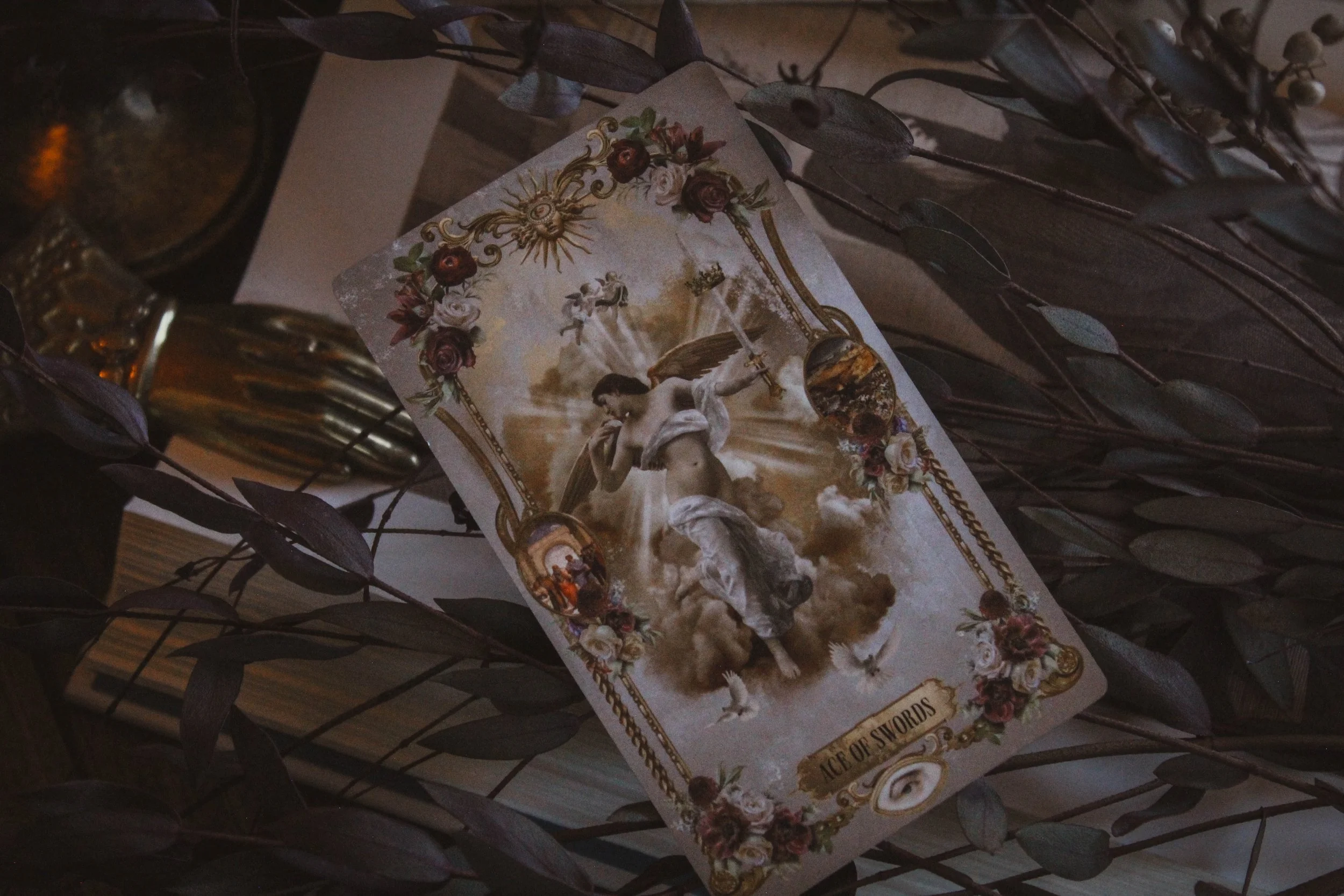
Absolute favorite card: Ace of Swords
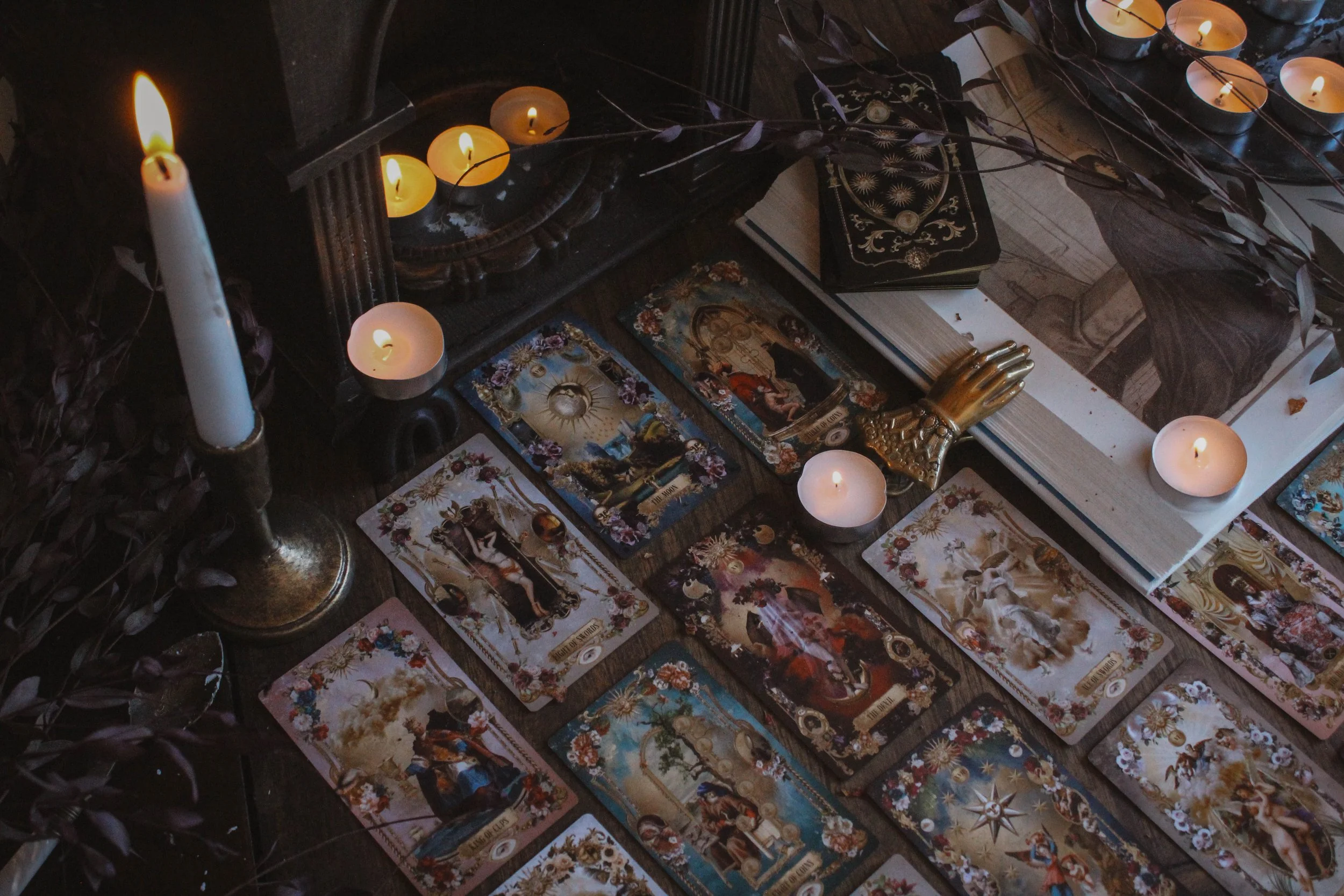
Other favorites: (in order from most beloved): Eight of Swords, Three of Coins, Eight of Coins, The Star, The Moon, The Devil, The World
Notable detail: Velvet box feel
Season: Summer
Sabbat: Litha / Lammas
Sign: Leo
Element: Fire
Deck compliment: Tell Me You Love Me Oracle
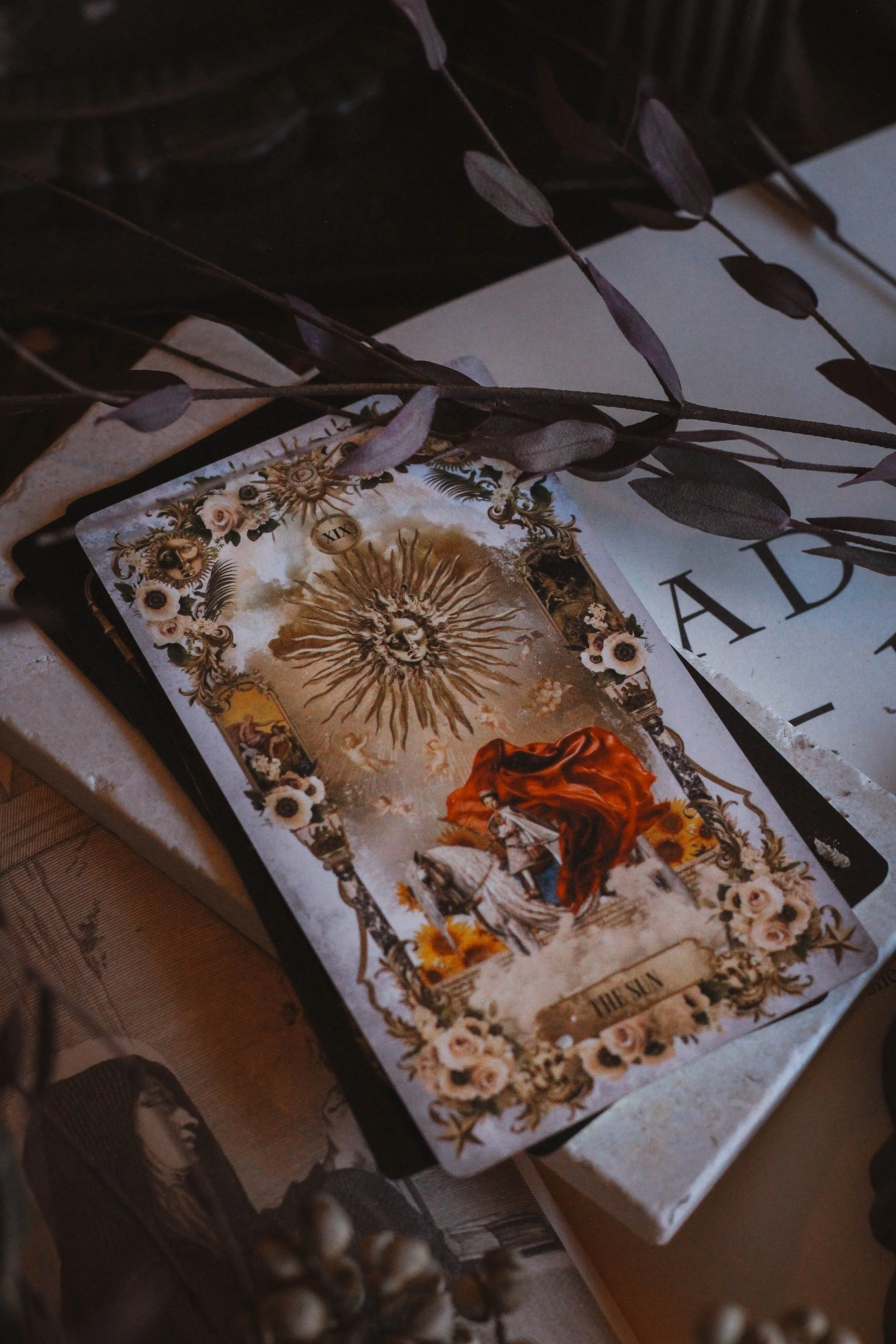
Collective Pull: The Sun
Some of my favorites
First Impressions
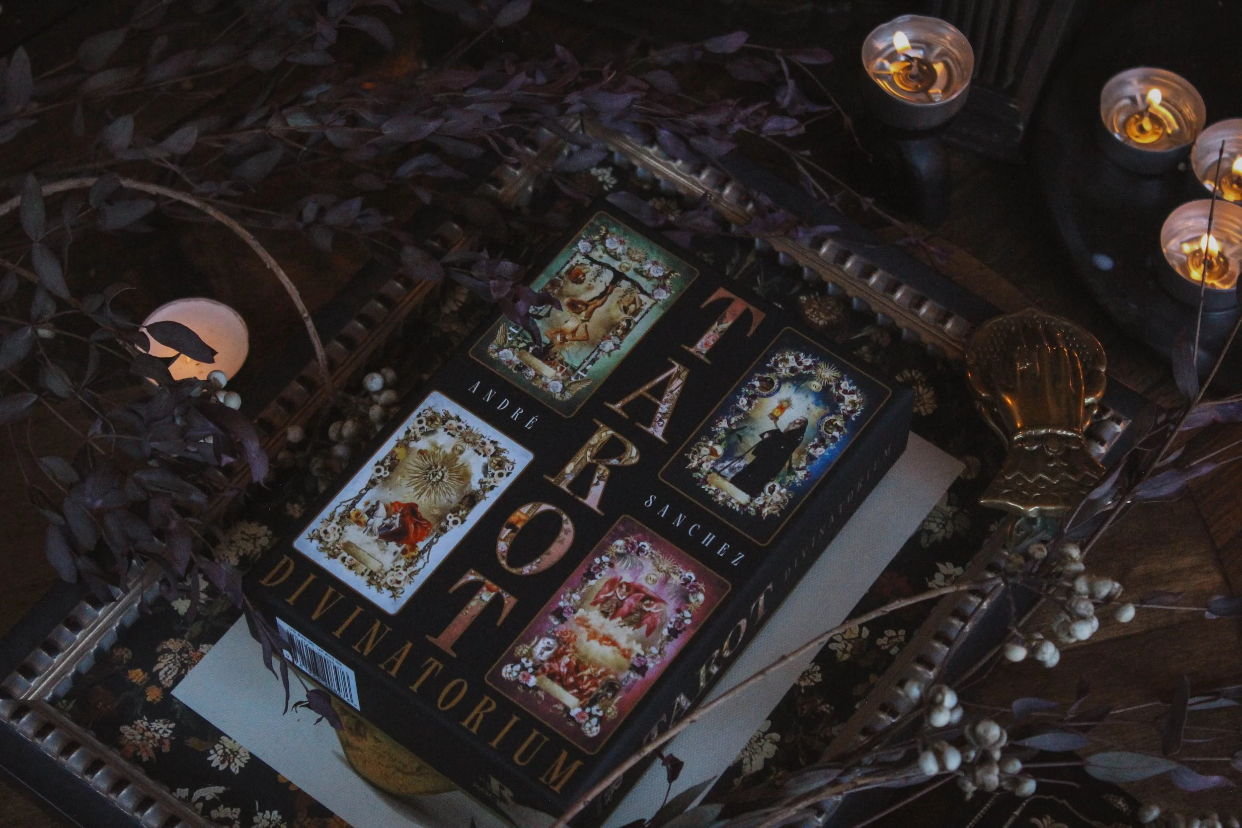
When I first saw the deck digitally, I felt like this would be right up my alley. It reminded me a lot of Tell Me You Love Me Oracle which I loved. When I get it in person though, I’ll admit that I’m not sure this one is really for me. I kind of don’t get it, if I’m being honest. It seems incredibly well thought out and there are a lot of small details which show great care. But ultimately, I have to say that this one might be more complicated than I feel I need in a deck. Let’s take a closer look and you tell me if you’re feeling the same or if this one resonates and you’re ready to add it to your altar.
The Packaging
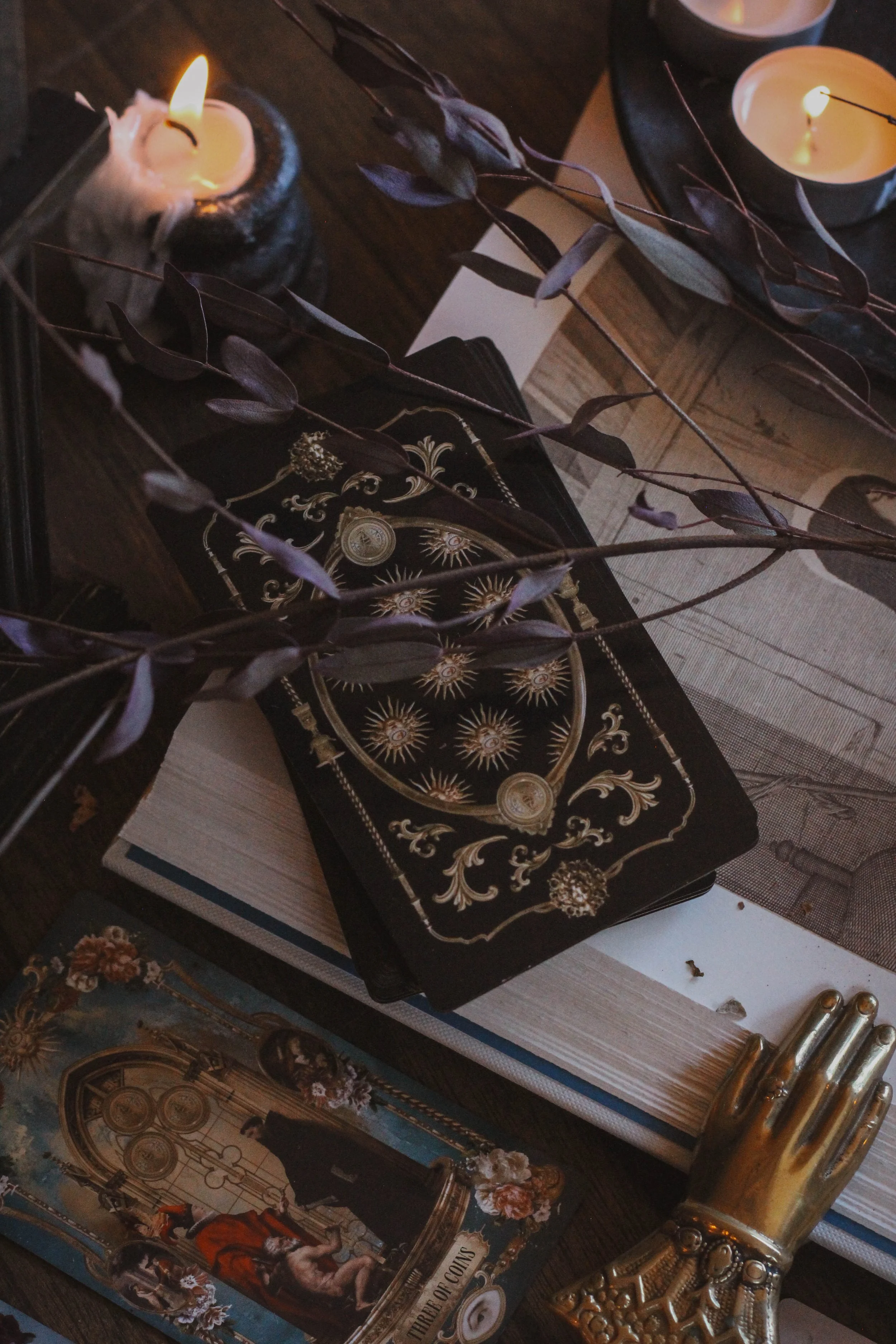
Great packaging. What can I say? If you’ve read these reviews for a while then you know Rockpool is king of packaging, end of. The stand out feature is the top part of the box with a beautiful velvet feel to it. That is my absolute favorite box treatment. It’s just so smooth and luxe and then they went and added gold foiling too. Rockpool will absolutely splurge on those extra details which is why their packaging is so good.
The cardstock is pretty standard for them too. I’d say just a touch on the thin side but that might be more ideal for 78 cards anyway. It shuffles well so far without any damages like bent corners. The cards are gilded which again, Rockpool always does unlike some other publishers who still seem to be missing the memo. It’s gold and usually Rockpool uses a more unique color but honestly, the gold matches perfectly. It didn’t need something like red or teal at all.
The print of the cards is more of a gloss which isn’t my favorite. It’s the same treatment on the Seasons of the Witch tarots which again, isn’t my favorite. I understand the choice, it does make the images look nice. I just have a thing against glossy cards. This is mostly because I’m a photographer and they pick up glares, especially because I use a lot of candles. But it has nothing to do with the use of the cards. So unless you’re taking photos, gloss won’t make a difference really.

Judgement & The Hierophant
The Guidebook
Rockpool does their guidebooks just as well as the packaging. They are always full color and designed especially well. I have worked with the creative director at Rockpool for the better part of a decade now and while we don’t always agree, I can say that she pumps out some really remarkable designs. She’s really great about taking the theme and pumping it through the whole deck.
Inside the guidebook, you’ll find:
Introduction
How to use the cards
Three spreads
Card meanings
I’m not so sure how to use the cards is the right name for that section. It’s really just the three card spreads. There’s nothing else about dedicating, shuffling or anything like that so I feel like that section could’ve been renamed. I do like the last spread though. It utilizes piles which I thought was a cool and interesting idea. I haven’t had a chance to use it yet but I’m really looking forward to it.
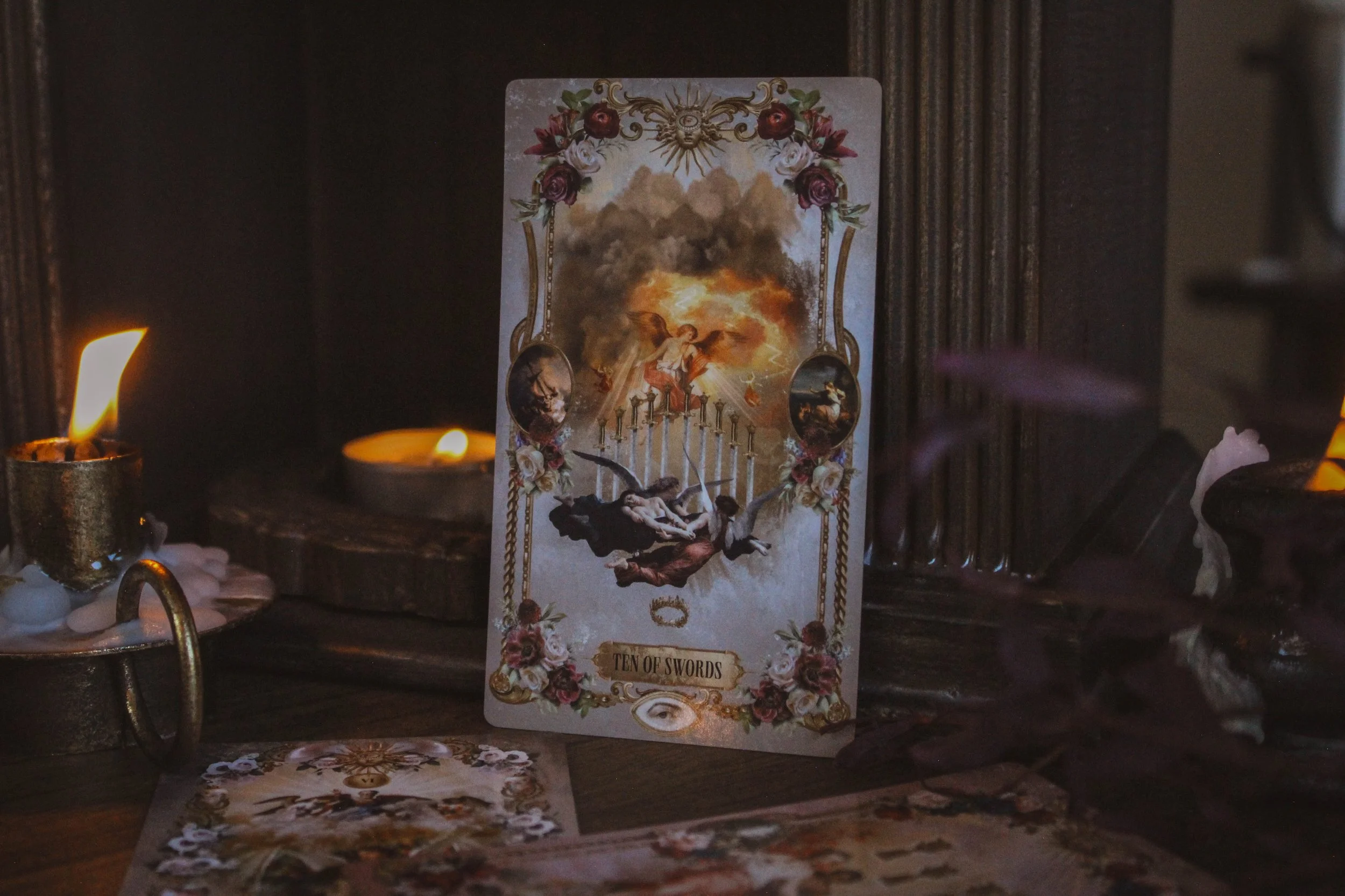
For each card, you get a picture of the card, keywords, a description of the image which includes the card meaning towards the end, and then the right and left vignette. That’s where things start to get a little sticky for me. Each card has a small oval on both the left and right side of the image. Inside of each oval is another image which is really, really small. The right side is supposed to represent the negative aspect of the card and the left is the positive. But I have no idea when the left is what I’m supposed to read versus the right, other than me just following my intuition as a tarot reader. I feel like these would’ve been better utilized at the top and bottom so that you can read them as reversed and upright. But ultimately, I just don’t get what purpose they serve.
The images are so small that you can’t really pull any symbolism out of them and because there’s no real explanation in the guidebook about their function, I just don’t really know what to do with them.
Theme
From what I can tell, this deck is a study of 16th century Europe, focusing heavily on European nobility, mostly because that’s what art consisted a great deal of at the time. It also explores other common symbols of that age like angels and religion in general.
My favorite card
The Artwork
First let me say that I love paintings from the 16th, 17th and 18th centuries. I think there’s something so grounded about paintings from that era. We just don’t see things like that anymore. Don’t get me wrong, there are some amazing painters now. In fact, I’ve just started my art journey by collecting pieces that I genuinely love from current painters. But as much as I love what’s available now, it just doesn’t feel like these old paintings.
I’m not a religious person because I don’t believe in the institution that is the church. But I find religious art and architecture really comforting which is a lot of what this type of art consists of. So the artwork I love. I could do without all of the intricate borders but at the same time, I am truly a maximalist so I appreciate it even if it's not my favorite.
“Featuring impressive paintings by famous Old Masters such as Botticelli, Rubens and Caravaggio, these digital collages spark your imagination and help you navigate the tough questions often asked during a reading. ”
My favorite card is the ace of swords. I really like the color palette on this one. I think the soft purple and gold with the darker magenta feels so feminine which is a nice surprise. The ace of swords isn’t really a feminine or soft card so I feel like this image gives it a more hopeful quality. The eight of swords has a similar style and color palette.
Reading With this Deck
Reading with this deck has been pretty fun to be honest. I pulled the Queen of Swords for this deck’s personality but actually, I have found it to be really playful. Reading with it kind of feels like talking to a court jester. It feels lighthearted in a way I really didn’t expect even though I’ve mostly pulled cards with heavier energy. The first cards I drew was the Emperor and the Queen of Wands. The only minor card I’ve drawn (I don’t really consider the court cards to be minor) is the four of coins.
But the way it presents cards is what feels playful. Nothing feels too serious or precious and I appreciate that. I am all for deep spiritual work but it's nice to have a deck that presents you with what you need but doesn’t feel like it's screaming at you or pushing you to tears. Lately, my decks have all been a little too close to home and this feels like a nice break from that.

With companion deck
Season, Sign, Element and Sabbat
I chose summer because of how bright and colorful it is. There’s also a sun at the top of every card and in some ways, I feel like the energy is more masculine. It doesn’t feel aggressive necessarily but it does feel like it’s taking up a lot of space energetically. It feels like it's not trying to be muted or relaxed. It’s full on maximal energy which is a summer quality. It’s also a Leo quality which is why I chose that for the zodiac sign. Leo is over the top and dramatic and maximum output which I see mirrored here, not just in the artwork but the inclusion of the vignettes too. It feels like there’s just one thing too much and that to me says Leo more than anything else.
I chose Litha and Lammas for the sabbats, the summer holidays for the same reasons mentioned above. And then I chose fire for the element, again because there is a clear connection to the sun here. The sun is a prominent symbol but there’s also so much gold spread throughout too. And funny enough, I even drew the Sun for the collective pull.

Collective Pull
Collective Pull
I pulled The Sun for you. The sun is a reminder to focus on what is good and happy and content in your life. Perhaps that is a struggle after what has felt like an extended period of darkness. Let this card serve as your sign that the light has truly returned, even if only for a short while. Relish whatever warmth you can find. Learn to seek out joy rather than waiting for the other show to drop. You are allowed to stand in a positive place whenever and however you can kind it.
Don’t question the joys when they come. Instead, do your best to be present. There will surely come a day when the storms return again and in those moments, you’ll wish you had made the best of the good times. This card also guides you to be positive as much as you can. To try your best not to dwell on what is wrong or what could go wrong. A sunny outlook often leads to sunny results, even if you can’t see it at the moment.
Who is this deck for?
If you like fun, whimsical, kind of over the top decks then you’ll probably like this one too. It’s very bright and colorful. It kind of reminds me of a TV show called Versailles in the sense that it's serious but also comedic and lighthearted. It’s theatrical I’d say. I do think that if you like Tell Me You Love Me Oracle visually, then you’d likely care for this one too. And if you like decks that have a little bit of complexity or a unique feature, then give this one a try. The vignettes weren’t for me but it might be up your alley and if you think the idea is cool then run with that.
Deck Companion
Tell Me You Love me Oracle was the first thing that I thought of when I saw this deck. It really reminds me of the look and feel so I felt that would be a perfect match. Sometimes I like to pair a more minimal deck with a more maximal deck but in this case, I love that both are so over the top. Plus, they are both influenced from old art so I feel like much of the symbolism is the same.

Inside guidebook





Ten of Swords