Tell Me You Love Me Oracle Review

This page may contain affiliate links which may allow us to collect a commission when you click and make a purchase through the links on our site. There is no additional cost to you for doing so.
Title: Tell Me You Love Me Oracle
Art by: Voglio Bene
Author: SandyTatoo.2.0
Publisher: Rockpool Publishing
Number of cards: 44
Card size: 5 x 3.5 in
Box size: 6.5 x 4 x 1.5 in approx
Guidebook pages: 106
Purchased or gifted?: Review copy provided by Rockpool Publishing
Absolute favorite card: Effort, fatigue, lassitude
Other favorites: (in order from most beloved) Discovery, unveiling, laying bare; hope, future, liaisons; smiles, joy, happiness; correspondence, message, letter; wisdom, temperance, calm; future, anticipation, preparation; femininity, beauty, naturalness
Notable detail: Naked Bodies
Season: Summer
Sabbat: Litha
Sign: Leo
Element: Fire
Deck compliment: Tattoo Tarot
Collective Pull: Freedom, autonomy, mobility

Generosity, compassion, kindness
First Impressions
I don’t usually go for the tattoo style although I do like it from time to time. So when I saw this on the review list from Rockpool, I was apprehensive about it. I knew I felt attracted to it but I wasn’t totally sold—I asked for it anyway. And then I got it in the mail, opened it up and WOW, I fell in love with it right away. The style reminds me a lot of the introductions for the White Lotus, especially the second season.
I flipped through it and had to put it down because I was in a rush that day and wanted to give this deck proper attention. I was so excited to work with it and review it. I didn’t want to rush through it at all. I have a lot of really good things to say about it and a point or two I’m not too keen on but it's not going to stop me from using this deck, let me just get that out the way right now.
I also have a friend who I felt this deck is soooo perfect for and immediately bought it for her. It's the kind of deck I want to give to so many women. So, let’s take a deep dive into this… I’m so excited for you to see this article.
The Packaging
If you’ve read my previous reviews then you know the award for best packaging goes to Rockpool. They’re packaging is consistently good, across the board. They love to do the soft velvet feel on the box which is such a tactile treat. They print full color inside and out. The boxes are sturdy and the cards always come gilded, often with very unusual colors. They even take it a step further and design the little wrapper the cards come in. I loved that so much, I started keeping them in the bottom of the boxes.
The gilding here is gold which isn’t an unusual color but damn if it doesn’t match the deck perfectly. Aesthetically, it's a masterpiece because theme is just so consistent. Everything about it clicks and nothing feels out of place. The reds, the gold, the filigree on the top of the box. Bravo.
Oh yea, the cardstock is great too, lol. Nice balance between thickness and ease in shuffling. The only thing that I don’t absolutely love is the design on the back of the cards. It’s perfect for the deck but just not to my taste.

Guidebook
The Guidebook
Again, Rockpool does phenomenal guidebooks. They are always full color, always feature images of the cards, and always have a nice background rather than just plain white paper. No exception here.
You get an introduction, how to use the cards, and several spreads. What I absolutely love is a spread called First Names Spread. I’ve never seen anything like it and it's soooo good. It involves adding up the letters of two or more persons' names and selecting a card based on the answer you get. Obviously it's a little more involved than that but it's such a good idea, I don’t want to share it. You’ll have to buy the deck and give it the proper respect it deserves.
For the cards, the actual names of the cards are keywords so you get that right off the bat. They are also repeated in the guidebook along with a short sentence, a general meaning and then an additional meaning for whether “you're single or in a love triangle.”
Theme
So I loved this deck’s vibe so much that I’ve decided to add an additional category to these reviews which is the theme. I don’t know why I didn’t think of doing this before. Each deck has a theme and while I do talk about them some, it's only in bits and pieces that don’t really fit into the other categories and this deck absolutely needed its own space for it.
The theme for this one is love but it's not as simple as you think. I think this deck does an excellent job of highlighting just how complicated love can be. It brings into question unconditional love and whether or not that’s truly possible. It urges you to explore your own sensual exploration, to face feelings of paranoia, and even makes room for temptation and seduction. It feels very sensual in the best ways while also being a serious deck.
I’ve been chatting with my friend Tenae Stewart a long time about how we haven’t found any really good love or sensuality decks despite our best efforts. This is the first love deck I’ve had that truly stole my breath away. This is the love deck I would recommend hands down.

Some of my favorites
The Artwork
Ok, now let’s dig into this artwork. The art is gorgeous. It looks like it belongs in a museum. It certainly has a Rococo era feel to it. Like I said before, it reminds me of the introduction to the White Lotus for season two. I could easily see these images adorning a villa in Sicily. What I appreciate most are the naked bodies. I love how sensual the artwork is. Everything feels open, free and just a bit naughty.
My favorite card is Effort, Fatigue, Lassitude. I love the cracked face. This idea of being “fractured” keeps coming up for me (looking at you Matt). But also the keywords resonated with me. Fatigue is a real thing, especially for creators so when I saw it, I felt an immediate resonance. The cracks feel like such a good way to portray the message. I suppose feeling the weight of so much pressure is like cracking into pieces.
“Love has always been sold as the symbol of absolute happiness, which must be attained for your life to be considered a success, yet it is also very often badly experienced and can become destructive or even deadly, as in Romeo and Juliet.”
In truth, I love so many of these cards, I could talk about them for hours. And of course I have tons of photos because of course this deck was so beautiful to photograph. Be sure to check them out to see the various naked bodies, some of my other favorites and a general look at all of the stellar art you’ll find throughout this deck.
The only thing I don’t like is the lack of ethnic representation. There isn’t any at all to be honest with you and that’s a shame. It’s something that’s just too hard to ignore in 2025. It would probably be a perfect deck had it not been for that.

With companion deck - Tattoo Tarot
Reading With this Deck
I’ve loved working with this deck. The readings have been so on point for my love life, especially the card that told me it's ok to wait for something that falls into place. I’ve been getting a lot of pressure from friends and family to “fall in love” when I just haven’t felt a connection. I’m not ready to settle and this deck has confirmed for me several times that I shouldn’t have to. It’s been so validating, not just with that but with so many different things.
I know I’ve said this before but as far as a love and relationships deck, it is by far the best one I’ve ever had. I don’t think it’s as ideal for other kinds of readings, for instance career or spiritual path but when used for love, I have gotten so much out of it. Not that you can’t use it for other things, I just think it shines most for love. It's a new treasure for sure.
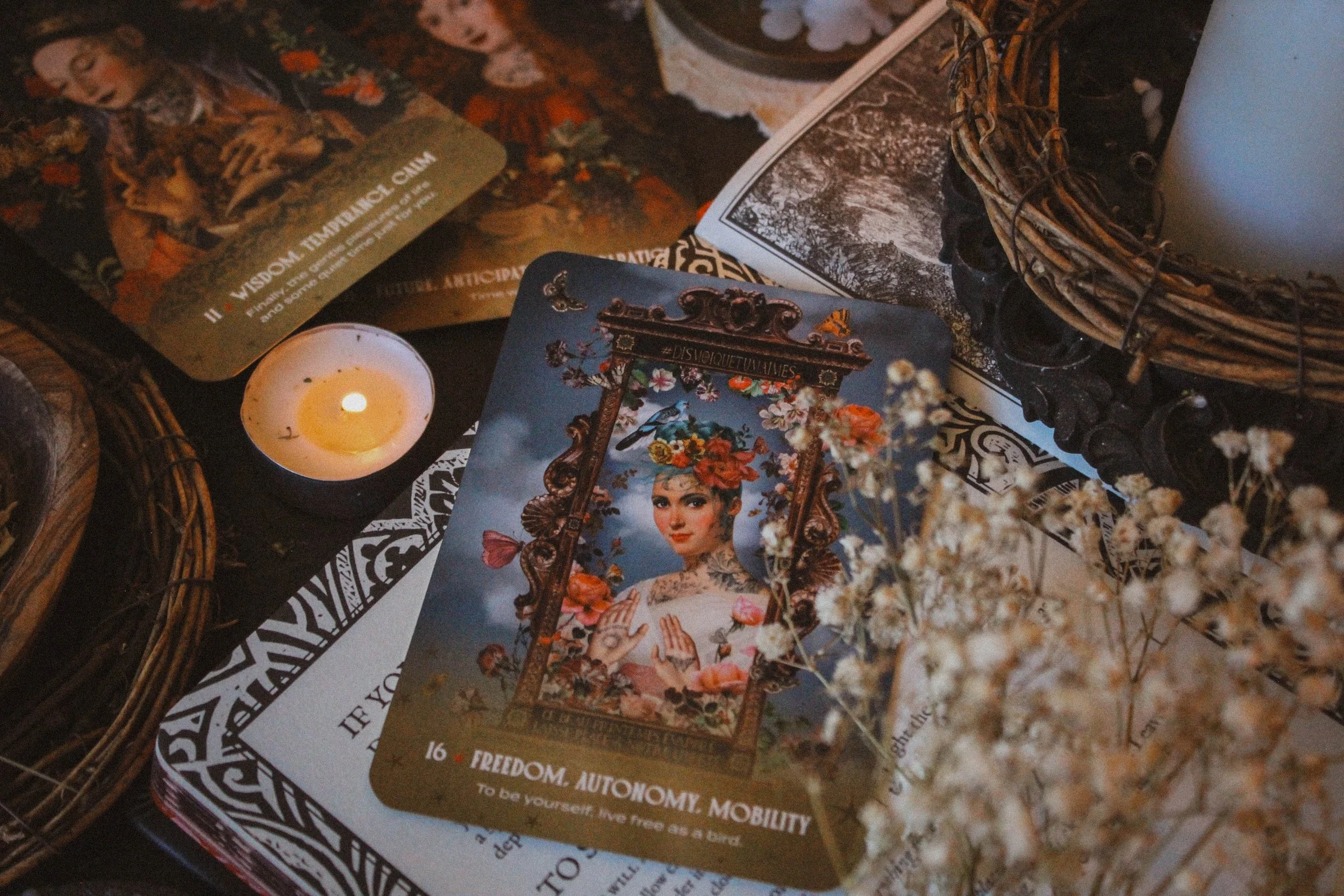
Collective Pull: Freedom, Autonomy, Mobility
Collective Pull
I drew Freedom, Autonomy, Mobility for you. This card invites you to explore your freedom. To decide whether or not you’re actually willing to do the hard work of fighting for something be it a relationship or job or place where you live or an idea. Something in your life will require effort to keep but know that there’s nothing wrong with wanting to let go. If your heart has left the room then perhaps your body should too. In doing so, you’re not just freeing yourself. You’re also freeing anyone or thing else involved. If an idea doesn’t touch your heart then give it to someone who can truly make it a reality. If you cannot love someone with your whole heart then let them go so both of you can find love the kind of love you individually need.
Season, Sign, Element and Sabbat
I went for summer with this one, mostly because I look at it and I can almost pretend I’m writing this review from Palermo. But all jokes aside, the artwork is lush, featuring lots of flowers, birds, butterflies, and warm skies so it's not hard to see summer running through it.
I went with Leo for the sign but this was a tough one. I wanted to say Aquarius at first and I suppose that makes sense seeing as Leo and Aquarius are opposites which means, they express similar themes but in opposite ways. So it makes sense that I would go back and forth between the two. However, I settled on Leo because of how “extra” the deck feels but in the best possible way. The characters here are expressive and I could even imagine many of them being exhibitionists which is much more of a Leo thing.
The sabbat is Litha, easy. Bold, bright energy made that an easy choice but Beltane is also a really good one for this, especially when you think about it from the sensual, sexual, relationship angle. Finally the element is Fire. All of these figures have a fire quality to me. Again, expressive, bold, bright, fierce; all things belonging to fire.
Who is this deck for?
If you’re looking for a love deck then run, don’t walk and get this one. Hands down the best love deck I’ve encountered so far. Is there room for improvement? Well yea. No deck is perfect, mine included. There’s always room for improvement but this is pretty darn good. I highly recommend it and stand behind it.
Keep in mind, this isn’t just about romantic love so if you’re someone who does a lot of relationship readings be that for romantic love, friendship and so on, then get this one. It does a great job exploring themes which present themselves in all relationships including the relationship you have with yourself.
Deck Companion
Tell Me You Love Me Oracle isn’t really a tattoo style, not in the traditional sense but it did remind me of the Tattoo Tarot. That was the very first thing I thought of when imagining a pair and I think they work quite well together. The colors are very similar though done in different styles. It kind of reminds me of my rule when it comes to mixing patterns to wear, which is that it almost always looks good if the patterns are different but the colors are the same.
And I think the energies match well too. They just seem to get one another. I think this one might be one of my favorite pairings.
Thanks for reading all the way through. If you found this review to be helpful, informative or entertaining in any way, please be sure to leave a comment down below. It really helps me know what you’re enjoying so that I can provide more content based on what you love. In the meantime, please enjoy a variety of photos from this deck.
And of course, if there is something you’d like me to consider reviewing, please comment below or email me at hello@spiritelement.co


Naked cards


My favorite card: Effort, fatigue, lassitude