Witch’s Homestead Oracle Review

This page may contain affiliate links which may allow us to collect a commission when you click and make a purchase through the links on our site. There is no additional cost to you for doing so.
Title: Witch’s Homestead Oracle
Written by: Hadas Knox
Art by: Giada Rose
Publisher: Rockpool Publishing
Price: $26.95
Number of cards: 44
Card size: 5 x 3.5 in
Box size: 5.5 x 4 x 1.5 in approx
Guidebook pages: 152
Purchased or gifted?: review copy gifted by Rockpool Publishing
Absolute favorite card: Fairytales
Other favorites: (in order from most beloved): Foraging, Candle Dipping, Hayloft, Summer Rainstorm, Ancestor’s Portrait, Laundry Line, Beehives, Window Seat, Canning & Fermentation
Notable detail: Lavender sides
Season: Summer
Sabbat: Lammas/ Mabon
Sign: Cancer
Element: Air
Deck compliment: see note
Collective Pull: Village Witch
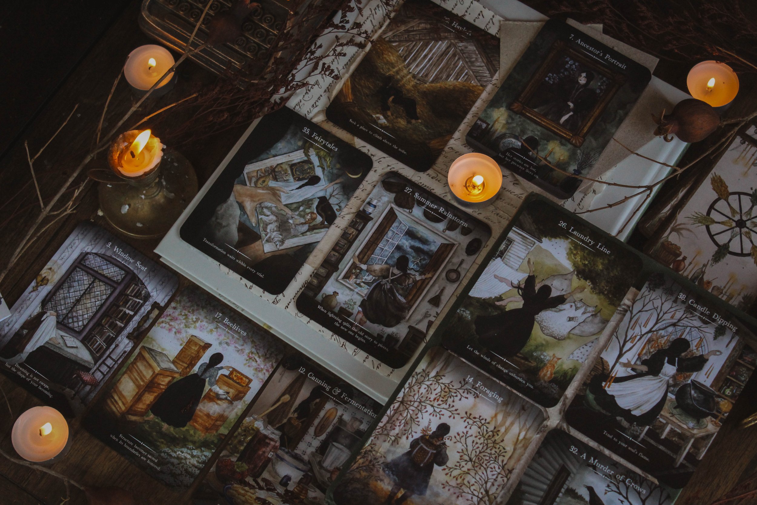
Some of my favorites
First Impressions
I absolutely loved the Folklore Oracle by the same pair and of course, I worked with Giada for years on the first three Seasons of the Witch Oracles. So I was excited to see another deck from Giada and Hadas coming out. But when I got it and looked through it, being totally transparent here, I was a little bit upset. It feels soooo similar to the Seasons of the Witch decks. The naming especially because I think that’s one thing SOTW did really well which is take everyday objects and turn them into oracle cards. We’re not the only ones to do that but we did focus a great deal on the home and even some of the names in this deck are things we’ve used throughout various SOTW products. And that with the phrases on the cards and obviously Giada’s imagery felt like this could’ve easily been an SOTW deck. I also feel like these images are just so much more in detail than the first SOTW decks. And it would be a lie if I said I wasn’t a bit jealous.
It’s still a gorgeous deck. I’m just sharing this because it is truly my first impression and I feel it's important to share my honest truth even if you might think it petty or in poor taste…I don’t know what you think so let me not project my insecurities. The point is that’s how I feel and I guess I just wanted to share it. I also just wanted to get that out of the way so that I can actually review this deck with an unbiased opinion moving forward. So let’s have a look and you tell me what you think.
The Packaging
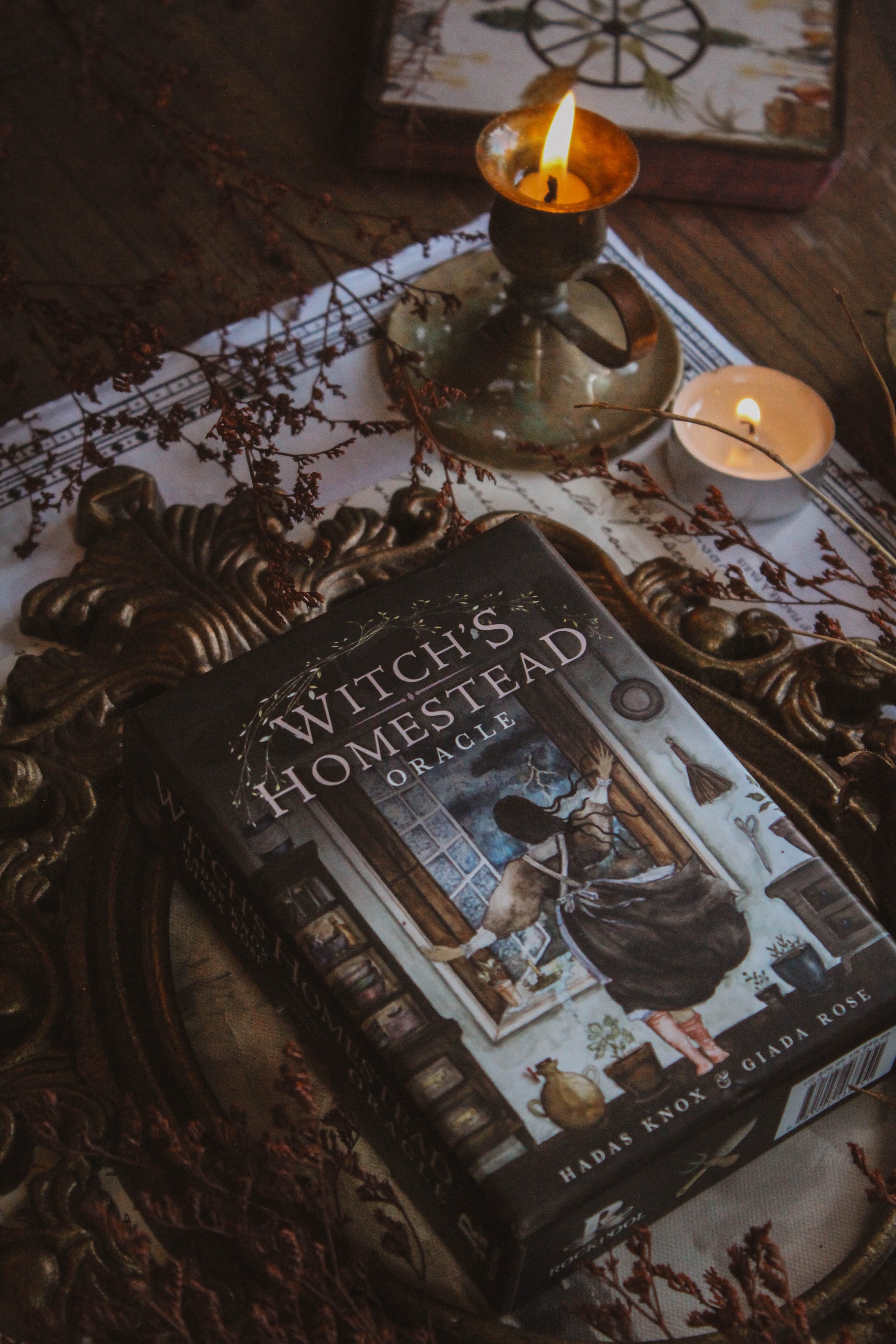
Great packaging as always. I’ve said it a hundred times, Rockpool does an amazing job. The standout feature is the gorgeous lavender sides. I say lavender because that seems to be a recurring motif but it’s more of a pinkish-purple color. It’s really lovely though. I may have preferred a more true lavender especially because the deck is so deliciously dark and moody. But maybe that’s why they went with the brighter color because it definitely stands out against the otherwise very dark (in color) imagery.
The cardstock feels just a bit thicker than normal. It still shuffles well and does the job but it does feel like it’s just a mm or two thicker. The box is full color as usual. The bottom is a creamy, buttermilk color while the top of the box is black. It reminds me of the Green Witch Oracle which had the opposite: buttermilk top with a black bottom. It’s really striking to have the top and bottom in two different colors, especially when you open it for the first time.
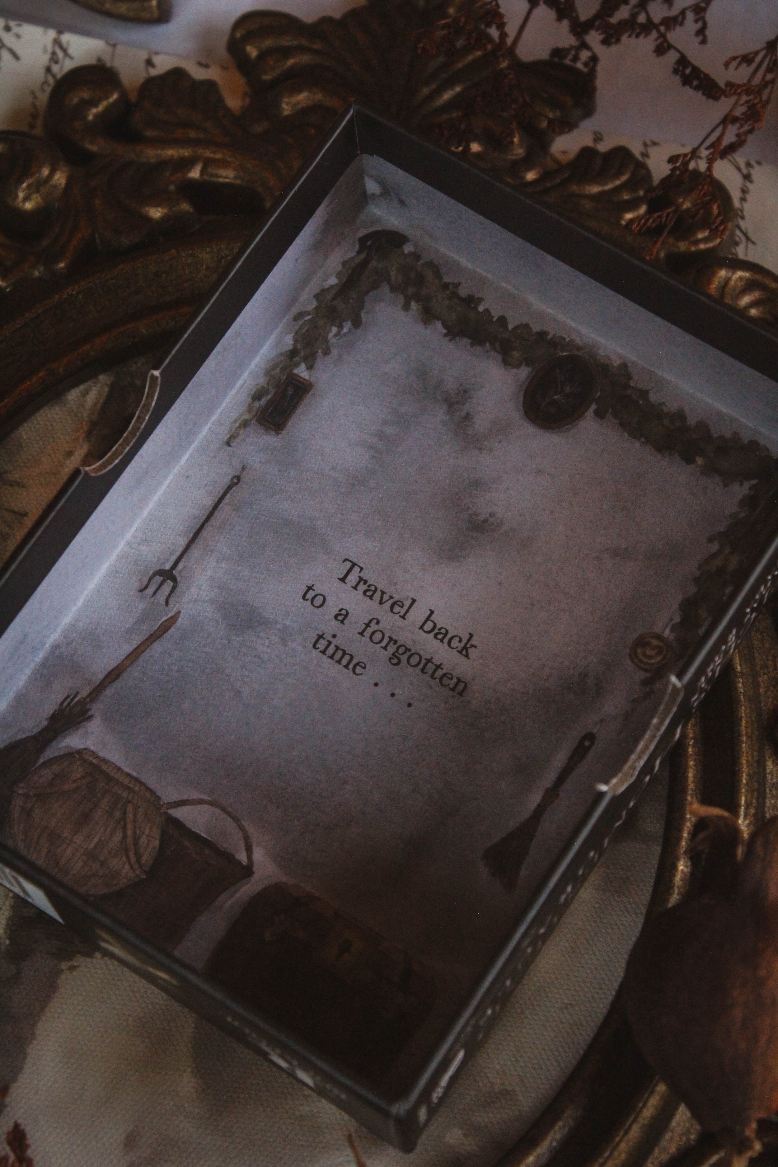
The insides of the top and bottom of the box are printed as well but what I love here is that it’s not just a moon or a pattern. There’s a full scene here in both boxes which is really nice to see. I am a firm believer that those little details make a huge impact and I hope this is something Rockpool does more often.
Finally, there’s the band that holds the cards together. For probably 2-3 years now, Rockpool has been printing these bands with something that matches the deck. I think I may have seen one other deck outside of Rockpool that’s done the same but for the most part, this is a Rockpool signature and I love it. I keep each and every band, making sure to pull them off gently. I have no use for them but I LOVE that attention to detail. This one has lavender printed on the band and I may actually use this for photography or something else decorative.
Actually there’s one more thing I want to point out. If you look at the box from the side, it looks like there’s an eye watching you, especially with a little bit of distance. When you look up close, you’ll see it's actually a button but it sits in that thumb space where you open the deck which already has the curvature of an eye. Then the background is that buttermilk color so it looks like an eye, truly. I stumbled upon this completely by accident. I looked over at the deck and went “what the?” I don’t know if that was intentional but it is cool.

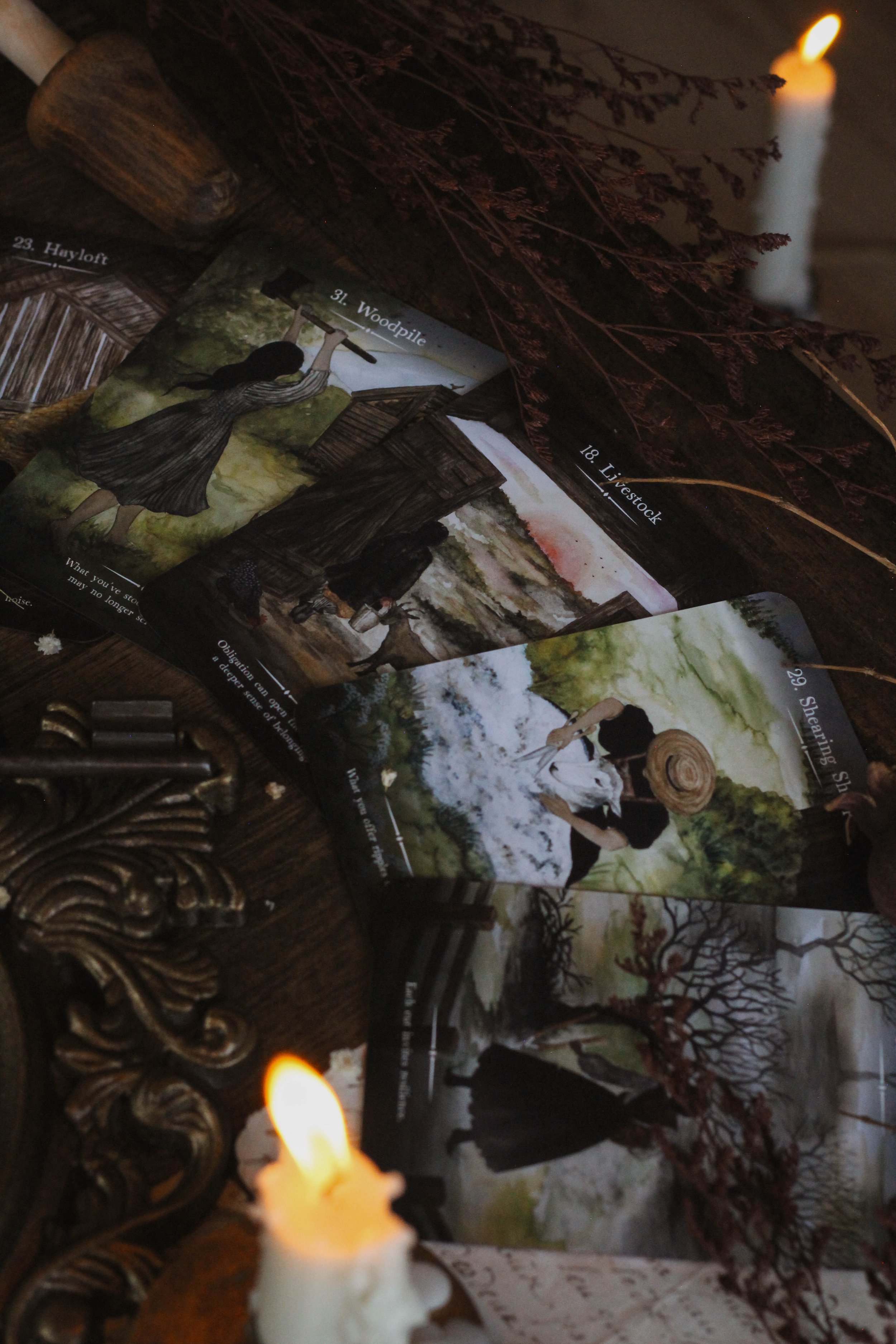
Hayloft, Woodpile, Livestock, Shearing Sheep
The Guidebook
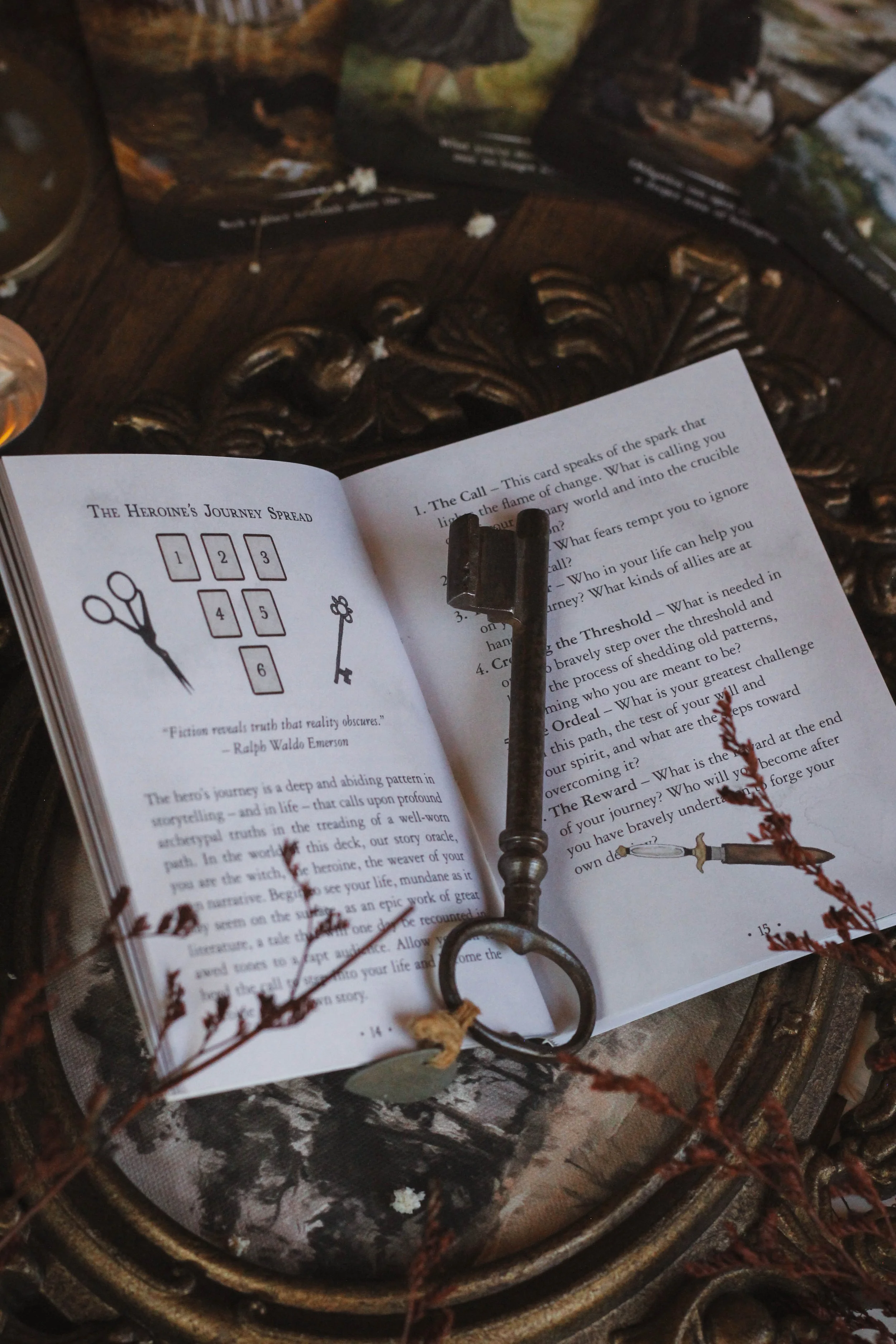
The guidebook is pretty hefty and of course is in full color. I really like the background for the pages. It looks like aged paper but done in a really good way. Sometimes that aged paper look looks more like cardboard. But this is really elegant and makes a nice contrast to the darker cards. Inside of the guidebook, you will find:
An introduction
How to use the cards
Four spreads
For each card you have a nearly full page image of the card, the same phrase that’s on the face of the card, a card meaning and then a story to go along with the card. I’ve been on the fence about describing the card’s image. I keep going back and forth on my opinion. I think it's more important to have a clear guidebook meaning but I also know that sometimes describing the card’s image contributes to the meaning.
In this deck, I do think the story does a good job of adding another layer to the meaning. So I guess I don’t like when you have a story or image description but then the meaning is minimal or even an afterthought. I suppose it depends, is my answer. Regardless, I think in this instance, the guidebook is done quite well. It’s really thoughtful and I think Hadas does a good job including more unusual card themes.
One thing I know I don’t like for sure is the same card themes repeated in every single deck: protection, cleansing, spirit connection, wisdom. They were fine ten, even five years ago but now with so many decks coming out now, it seems outdated or minimum effort. You still get some of that here, especially rest and cleansing but you also get themes like the need to preserve things and looking at the process of aging. It’s a good mix and I would love to see more of that.
Theme
I really like the theme. It’s about the homestead but specifically the home of one singular witch throughout the year. I love that it feels like little snapshots of here everyday. It’s literally like being a fly on the wall as she goes about her daily tasks. What I love most is that it isn’t particularly magical in the doing a spell or dancing naked in the woods kind of way. This is just about daily living. We often reduce witchcraft or magic or energy to big ceremonial moments or the sabbats or the full moon when really, energy is occurring all of the time. Doing mundane tasks like laundry can be an experience of self-care just as much as a bath. Self-care isn’t just about sleep and beauty masks nor is magic just about candles and wands. So I love that they took that approach. It feels relatable and that’s something I can truly appreciate.

My favorite card
The Artwork
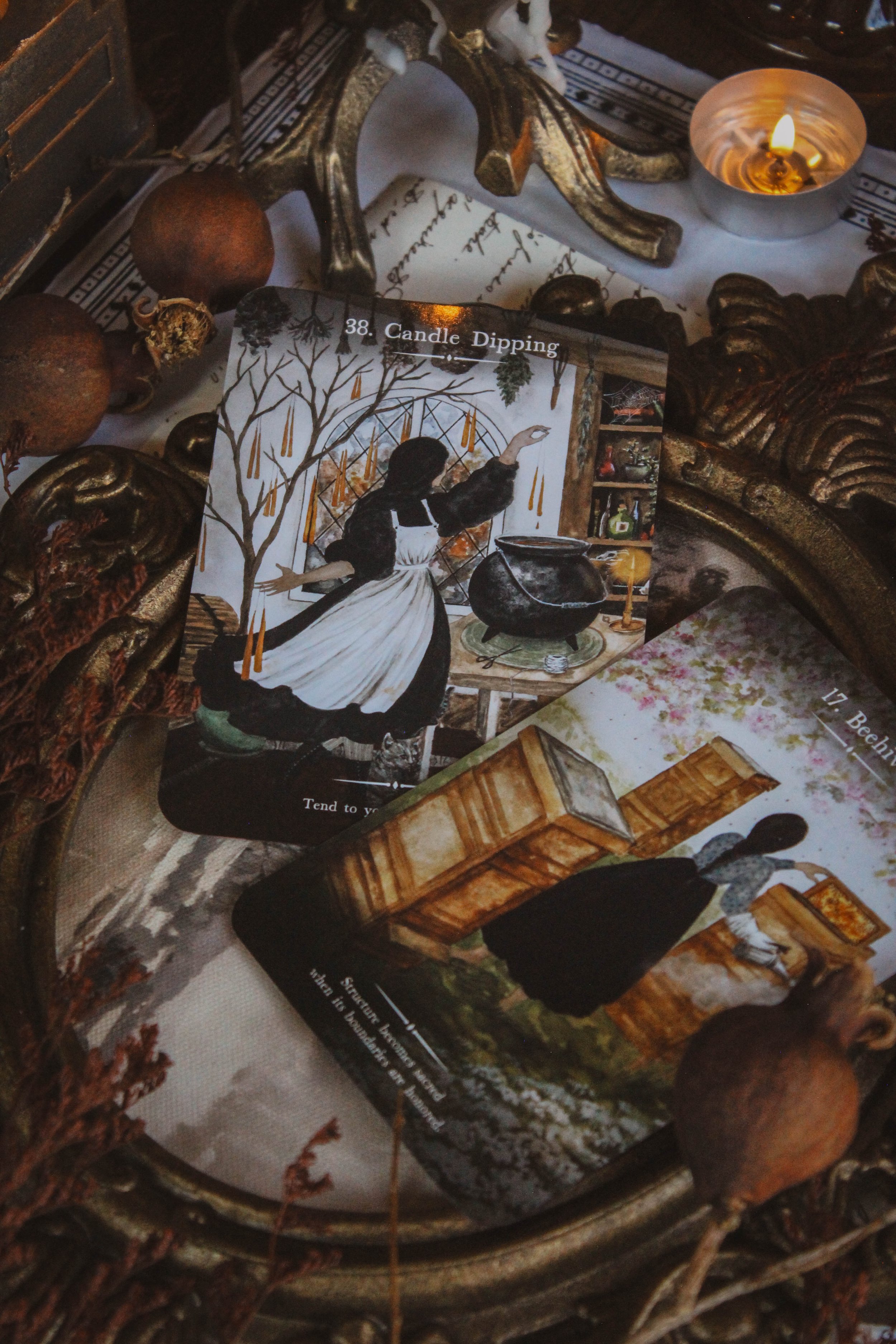
Giada’s artwork has really come a long way since the early days of SOTW. These images are really detailed and mysterious. I love that you don’t see the witch’s face in a lot of the artwork or you only see little bits of it. In fact, I think the only card that shows a full face is Ancestor’s Portrait and that shows the face of the ancestor, not the witch herself. I really love images like that but I feel like I’m always being pushed to shy away from images that don’t show a face. For example, I wanted the witch on the 2026 SOTW planner to have her back turned away and my publisher (same who published this) said we shouldn’t.
This is personal and has nothing to do with this deck but I do have some harsh feelings about it. I think images without a face or just the suggestion of it creates mystery and moodiness, something I feel I have been fighting for, for a really long time when it comes to my publishing work. Also something I don’t think I’m afforded enough of while others seem to have more space. But this is not about me so back to the art.
Giada’s last deck was really bright and this is a direct opposite and I love it. I fully support these darker tones. You see shades of blacks, deep blues, dark greens, burgundies and warm browns. I think the color is chef’s kiss.
“Our witch’s story reflects your own inner landscape. Each card whispers of her resilience and solitude. Each scene holds a piece of her tale, rich with the textures of wood, wheat, wood, flax and stone.”
My absolutely favorite card is Fairytales. I love how the woman in the book is reaching off of the page, towards the moon. It really gives this image a lot of movement and whimsy. But I also really love Foraging. It reminds me of my absolute favorite card from Seasons of the Witch: Beltane Oracle which is called growth. But this is like the autumn version of it and it's stunning. I love the little berries and the mist at her feet. I love the grass blowing in the wind down at the bottom corners and the whole scene looks like a perfect snapshot of autumn.
I have many favorites when it comes to art and could talk about them forever. But I do want to talk about the backs of the cards. This is a really nice card back and I think Rockpool is starting to step up a little more in this area too. This is more intricate and well-designed in my opinion whereas I have felt like some in the past have been more cartoony or even flat and pretty minimal. I think this one really matches the energy of the deck, I love that it's lighter to stand against the dark cards, and I feel like this could’ve been its own card. Even the glow on the candles feels sophisticated and unique.
Reading With this Deck
My first reading with the deck really smacked me in the face. I have been working on something for a really long time and finally made significant progress with it. I pulled the first card and the wording that I was using in the project matched the card exactly. The guidebook literally confirmed everything I had already been planning in a very eerie way. Words I had written down, ideas I had entertained, the mission of the project, everything. It blew me away honestly. It was exactly the validation I needed as if this card was made specifically for me.
But I have had readings where I feel equally dismayed; left wondering what they mean. I did a reading just before writing this review and one card felt like what I needed to see. Going back to that project, which is what the card was about, it told me that I need to release perfectionism and micromanaging. That things need time to evolve without me trying to force it to happen. That has never been my strength. I am a decisive person who likes to act on my instinct and intuition so leaving room for chance doesn’t fit my groove. But I understood the message and I often need to learn to have faith in things I can’t see.
But the remaining cards left me confused. The second card I pulled was Hutch. I was asking about my legacy I suppose and what I need to carry forward. I’ll have to let this card sit with me for a time. An answer isn’t always immediately clear, something I’ve learned my fair share of over the years. The last card was what I needed to know in general and I pulled Ancestor’s Portrait. I understood the message but also kind of didn’t.
My experience with this deck has been remarkably clear at times and downright confusing at others. But I’m enjoying Hadas’ writing. As I said in the guidebook section, I do believe she has chosen themes that are a bit out of the ordinary. That’s why I love using everyday objects for oracle cards. I think it forces you to find perspective rather than just relying on the same traditional self-care, wisdom, manifestation, protection bag of tricks. Hadas has done this especially well. I feel challenged to let a meaning settle and for me, a good deck is one that makes you think and reflect more so than just telling me to trust that spirit has got me.

Lavender card sides
Season, Sign, Element and Sabbat
I chose summer for the season. I really wanted to choose autumn, especially because the imagery is so dark but that never felt appropriate. There are too many scenes that feel summery in energy especially cards like beehives and summer rainstorm. And ultimately, what I see is a deck of card images that look like they occur during a summer rainstorm. That’s the image that’s on the box as well and I think it really does sum up the energy of the deck.
I chose Cancer for the zodiac sign because Cancer is the sign of the home. When it comes to domestic things, there really isn’t any other sign that speaks to that more than Cancer does. I would also include the earth signs though, at least Taurus and Virgo. You see a lot of everyday things in this deck like doing laundry or sweeping the house and those little, unglamorous tasks feel especially like Virgo.
I chose Lammas and Mabon for the sabbats because I think those are the most domestic of the eight. That’s the time of the year when there’s a big focus on getting things done like preserving the summer harvest, getting the home ready for the winter, maybe going through the attic and cleaning out things or taking out your fall time clothes. And also, this is often the time of year when we focus on gratitude and appreciating all that we have. Appreciating the home that keeps us safe.
Finally, I went with air for the element. Earth would’ve been an easy choice obviously but when I look at the cards, I felt like I saw a lot of movement. I could almost hear the storm outside or the mist rolling in. I’m clairaudient anyways and I know I have a good deck when I can hear sounds as I work with it. And all I’ve been hearing is wind rushing through. Plus when you look at the imagery, you see a lot of air quality symbols. Quills, planting blowing in the wind, books which are associated with the mind, the smoke on beehives, and birds flying in the background.
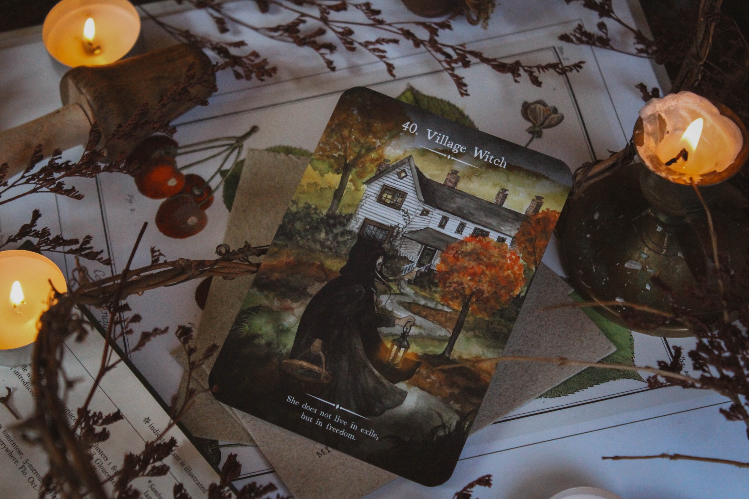
Collective Pull
Collective Pull
I pulled Village Witch for you. Allow yourself to be strange when this card appears. To trust that you know and see, feel and hear things that others miss. You listen to the words on the wind just as much as you believe plants respond when you talk to them. Everything around you speaks. Maybe not in the way humans communicate but that doesn’t mean you can’t understand. Yes, it’s true others might find you weird or lost in lunacy and what a pity for them. They will never know what it's like to feel the earth’s embrace or to find certainty in spirit’s whispers but you will. Don’t hide that part of you away. It makes you different and other but it also makes you free.
Deck Companion
I didn’t choose a companion deck for this one yet. I tried out a bunch of different tarots but nothing felt like it clicked into place. I think Giada’s art is so specific. It’s the perfect blend of folk, whimsy and just a touch of occult. There are a lot of decks like that but not with the same feeling. I can’t quite explain but I do know that nothing that I currently have feels like a solid fit. So the search continues. If you know of a deck that would match well, please be sure to drop it in the comments.
My Final Thoughts
On a personal level, I have some hard feelings that I need to work through but speaking purely about the deck, I will honestly say that it's gorgeous. I think Hadas is a really talented writer. I’ve been ranting about how I wanted to see something more unusual than the same decks it seems like everyone is pushing out. And I think that I got that in this. That combined with the incredible art makes this one an easy choice to add to your altar.
Do I feel like it could’ve easily been a Seasons of the Witch Deck or even mistaken for an SOTW deck? Yes, I absolutely feel that way. But if I had never heard of SOTW or been a part of its creation, I would’ve loved this deck immediately without hesitation. I still love it but deep down, there’s a part of me that feels a bit bitter. But I’m going to use it anyway because two things can be true at one time. I can feel something negative about this deck and use it to help me grow past it while also acknowledging how good it is. And that’s exactly what I plan to do. We all have tough feelings but with time, care and compassion, we can work through them.
So my honest review is to buy the deck. It really is a remarkable oracle.

Candle Dipping & Beehives






Back of cards