The Baddeley Tarot Review
This page may contain affiliate links which may allow us to collect a commission when you click and make a purchase through the links on our site. There is no additional cost to you for doing so.
Title: The Baddeley Tarot
Created: Jake Baddeley
Publisher: Blue Angel Publishing
Number of cards: 78
Card size: 4.75 x 4.75 in
Box size: 7.5 x 5.5 x 2.5 in approx
Guidebook pages: 368
Purchased or gifted?: Review copy provided by Llewellyn Books
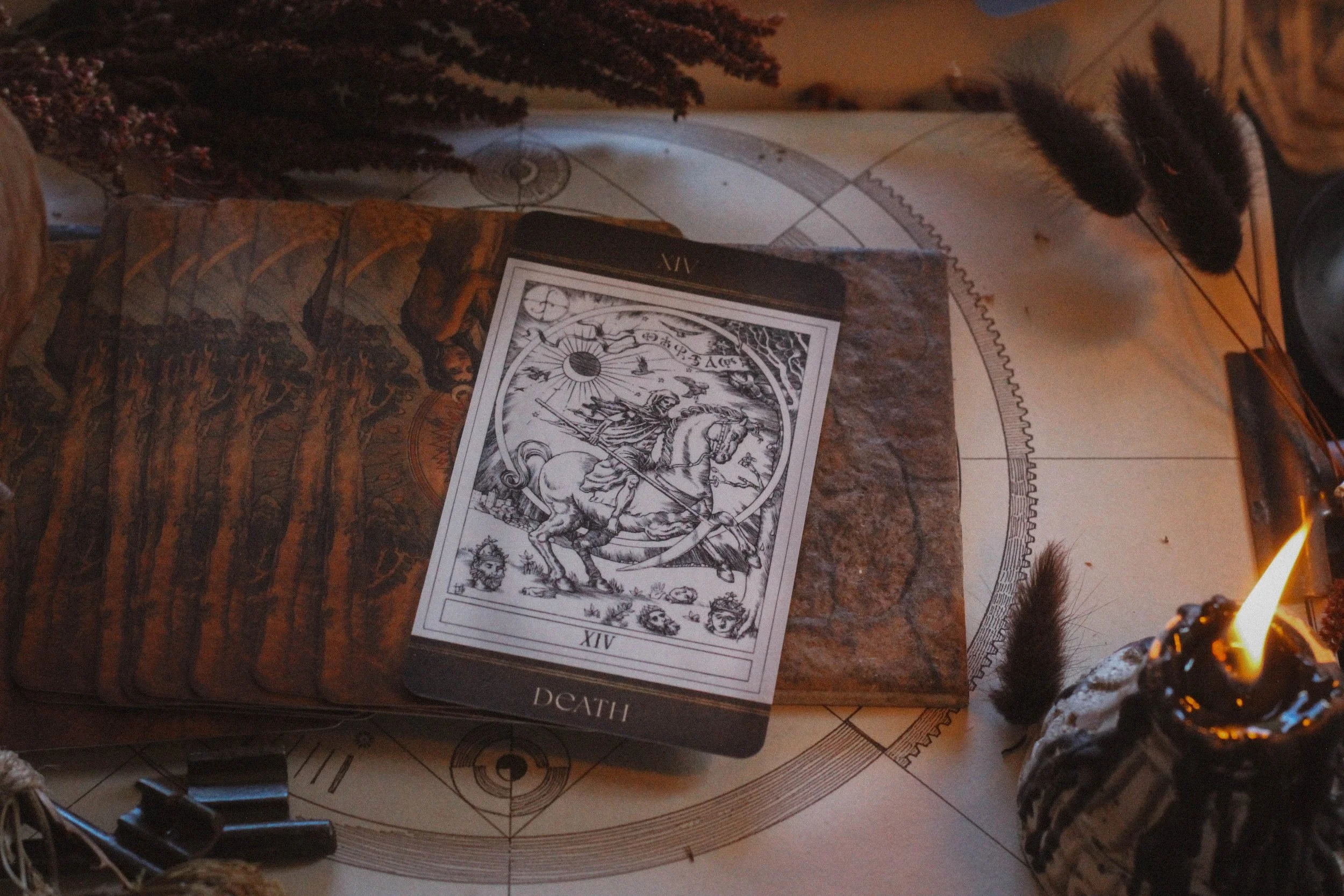
Absolute favorite card: Death
Other favorites: (in order from most beloved): Fortitude, The Wheel of Fortune, Ace of Batons, Ace of Cups
Notable detail: Large box
Season: Winter
Sabbat: Yule
Sign: Capricorn
Element: Air
Deck compliment: Supra Oracle
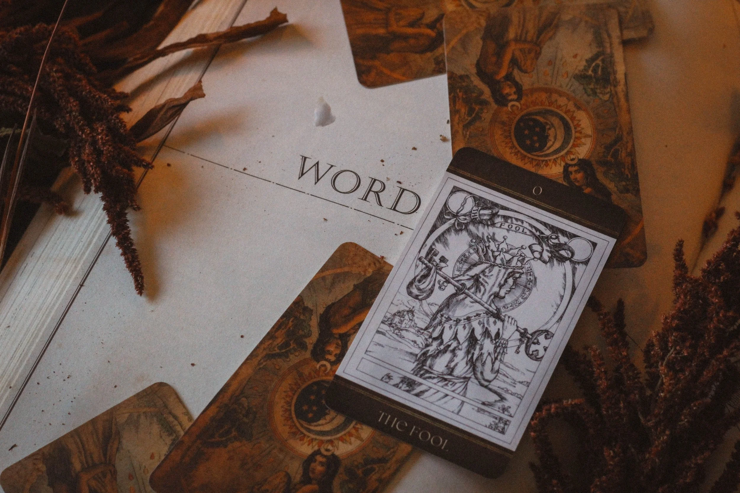
Collective Pull: The Fool

Ace cards
First Impressions
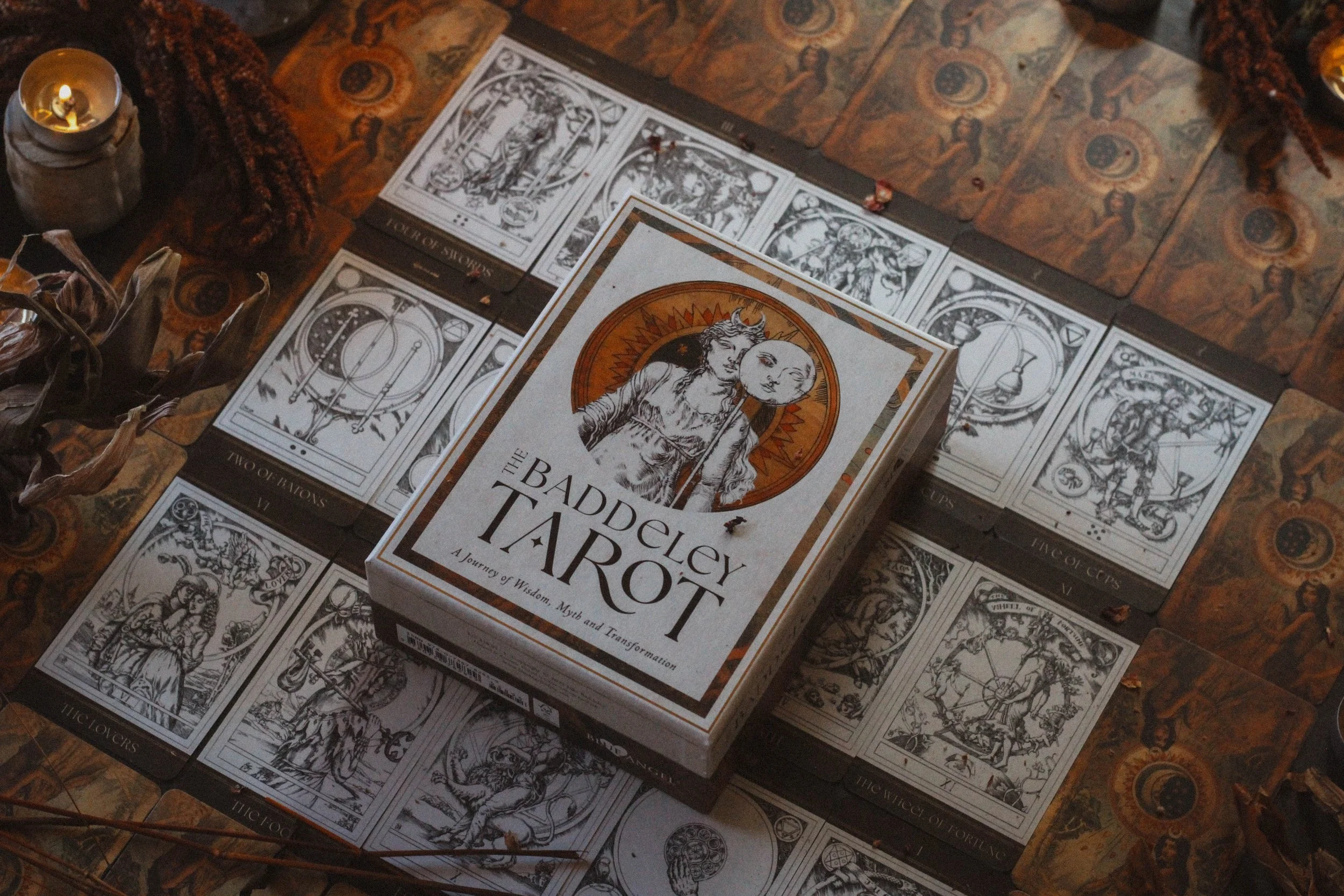
I’ve wanted this deck for a very long time. Blue Angel has been pushing it hard recently and because I’m a sucker for very minimal art on aged paper and black tones, I couldn’t help but be attracted to it. I’ve had it on my list to buy but Llewellyn surprised me with it in a recent review box (Put your desires out into the universe and ye shall receive) and I was positively giddy. Straight away, I can tell a lot of effort went into the production of this deck. The artwork is incredibly detailed, the box is HUGE, and it feels like an ancient deck rather than one available in 2025. So far so good. Let’s take a deeper dive and see what we find.
The Packaging
This deck comes in a big box. It’s pretty heavy as far as tarot deck boxes go. The design is fairly minimal with the only notable detail being gloss printing on the title and the large image on the front. There’s a small and somewhat gold detail around the sides of the box but everything looks so cohesive and I mean that in a really good way. I love a design that isn’t overwhelming. I love to see a consistent color palette which I believe shows elegance, restraint, and an incredible awareness of the soul of the project. Full marks for the box indeed.
There is a motif around the edge of the bottom part of the box and inside features a rust toned pattern which reminds me of leather. There’s a platform inside to hold the cards and that’s where I do have to mention a flaw. There isn’t a ribbon to lift the cards out of the box and considering how much care went into the rest of the project, I’m disappointed by this. Likewise with the lack of gilded edges on the cards. Blue Angel doesn’t spray any of their cards and how I wish they would.
I’ve gotten many decks from them that were nearly perfect save for the lack of gilded edges. An amber or brown edge on this would’ve been a knock out. I get the old world feel which obviously doesn’t include gilded edges but this isn’t 1458 and I think a sprayed edge would’ve been a nice blend of ancient and contemporary details.
The cardstock is perfectly fine. The deck is pretty thick so if the cardstock were any thicker, it would be near impossible to shuffle. Fortunately its matte printed which means the cards glide rather well and I haven’t experienced any rips or dings so far.

With deck companion
The Guidebook
The guidebook is the true notable detail. It’s 368 pages which is substantial. I have regular books that aren’t 368 pages so to see that in a tarot guidebook is a real treat. To be transparent, many of these pages are near full page images of the cards themselves but even then, there’s still a lot of content. I’m really pleased to see more guidebooks with more substance as of late. Because there have been plenty of decks in recent years that have been style and little to no substance. Seems like there’s a shift and I’m loving to see it. Inside the guidebook, you will find:
A Dedication
The Deep Roots of Tarot
A Short History of Tarot which includes a brief description of various tarot decks
A glorious section called The Mysteries of the Tarot - a must read!
The Fool’s Journey
A more in-depth look at the star and devil
Three spreads
A number of other sections I haven’t mentioned
This book is PACKED with knowledge and could’ve been a tarot resource all on its own. Every now and then, I get a guidebook that is genuinely just an awesome tarot book to keep on hand and this one definitely belongs near my desk. I have to really sit down and read the whole thing because there is so much to go through and so much to learn.
Look, I know lots of people care so much less about the guidebook than I do but I am a learner. I like to inhale information and after reading tarot cards for as long as I have, you find there’s not a lot of NEW to be had. But this book gave me plenty to study. So if you’re an experienced reader and looking for a much deeper dive then you will get a lot out of this book. And that’s before you even get to the meanings which are equally rich and well thought out. Particularly the reversed meanings which are quite in-depth. Just as much or more as the upright meanings.
Theme
I would say there isn’t a theme to be had really. This is more a culmination of the creator’s tarot studies. It’s his version of the traditional tarot, utilizing all of the symbolism and esoteric knowledge he has found to be valuable over the years. It’s a basic deck in the sense that no effort’s been made to remake the tarot. This is a celebration of the roots of tarot itself and reverence given to this ancient system. It’s the traditional tarot done really, really well and I can appreciate that. I’m a huge fan of evolution. I never want to be in the same place five years from now that I’m in today. I love to change and grow and I love the tools and practices I use to do the same. But, there is something to be said about honoring the old. There’s space to reinvent the wheel and keep it exactly the same, just refreshed. To me, the theme is someone who really values tarot and wanted to illuminate its greatness.

The Emperor & The High Priestess
The Artwork
The artwork is minimal at its finest. Not the boring kind of minimal that’s black, white and grey with all sharp, harsh lines and empty space. Not at all. This deck is “black” and “white” but the black is more like charcoal and the white is more like aged paper. I have a whole other life in interior design which I try not to let bleed too much into this space but I can’t help applying my designer's eye to this deck. The black is warm which is easier to achieve than you might think but you rarely find a warm toned black. In these images, you can see little hints of browns and reds if you look really closely. Which is emphasized by the brown borders at the top and bottom of the cards.
“I, like anyone else, can only guess what the original designers of the tarot meant when they chose the images adorning its cards; so in order to make this deck, I first had to spend many hours of research searching for clarification.”
Then there’s so much shading and line detail to look at. Take Death for example, my favorite card of the deck, which has so many small stars, birds, and dismembered body parts in the background. There’s a lot of movement and life for a card about death which is why I like it so much. Many people choose to focus on the death part of the card and one can understand, it is called death afterall. But the point of the card is that death isn’t really the end. It’s the end of one chapter, one journey or one expression but that doesn’t mean it’s the end of everything. There’s still so much life to be had and we can see this happening in the card. There’s an entire city in the background, a bright sun in the sky, plants full of growth and yes there’s some devastating elements too. But life still goes on and in this case, so too can you.
I’m also really fond of the ace and two cards. All them feature a large circle with their respective suit elements in the center. There’s nothing really profound about the artwork in that way, I just love the general minimalism of it all. It really does feel like an old world deck when things didn’t need to be so flashy to be impactful.
My absolute favorite card
Reading With this Deck
So far, just about every card I’ve pulled has been related to creativity or confidence. I’ve pulled the Empress a number of times from this deck and I’ve only had it a couple of weeks which I find so funny because I really consider this to be a masculine energy deck. I’ve also pulled the ace of batons quite a bit though not as much as the Empress. So far, I’ve had pretty rewarding readings with it. It’s definitely given me some things to think about, especially when it comes to both business and love. Though my readings have been so positive, I do wonder if maybe it’s too good to be true. Only time will tell I suppose.
Collective Pull
Collective Pull
I pulled The Fool for you. The Fool arrives in the moment of a sacred beginning. It’s easy to view this card as a moment of recklessness but its truth is a moment of a sacred beginning. A reminder that all true transformation begins with a leap into the unknown, no matter how foolish it might appear to those on the outside. We often romanticize the idea of new starts, but the Fool’s lesson is far deeper than naïve optimism. It’s the courage to unclench your grip on what you think you know, to meet life without pretense, and to trust that the unseen path will rise to meet you when you step forward.
Collectively, this card calls you to loosen your attachment to certainty. The world is shifting, and many of us are being asked to start over — in identity, in purpose, or in belief. The Fool invites you to see this not as a loss, but as liberation. To walk forward with open eyes and a soft heart, even if your knees are trembling with fear.
This is an initiation into trust — not blind faith, but embodied wonder. It’s the willingness to let curiosity lead again, to rediscover the magic in things that no longer dazzled you, and to risk being changed by what you find. The Fool reminds you that wisdom is not born from caution, but from movement. Will you step forward? Don’t wait to have the map. Be the mapmaker.
Season, Sign, Element and Sabbat
I’ll start with the zodiac sign first because this deck reminds me so much of Saturn energy which of course is the ruler of Capricorn. It feels stern, mature and structured. It’s a masculine energy deck which I don’t see too often. This deck is made by a man which doesn’t necessarily mean the deck will be masculine, it just happens to be so in this case. Anyway, all of the things Saturn is associated with are elements I find sprinkled throughout the deck thus, Capricorn felt like a clear winner. Not to mention, aesthetically, this feels like a Capricorn deck.
I chose winter for the season. It’s very minimal which I associate with winter elements like bare trees, wide open fields of white snow, and grey skies. The whole season is about retreat, turning inward and restraint. And this deck seems to be the same.
I chose Yule for the sabbat and I’ll admit, it took me a while to settle here. I don’t know that I love Yule as the choice since it doesn’t have any of the festive energy of Yule. What it does have is the qualities of winter and I really didn’t see another Sabbat working quite as well.
Finally, I chose air for the element. My first instinct was earth and that’s still a good choice but I settled on air because of the minimalism, the masculinity, and the light line drawings which all have an airy quality about them. I think the browns and blacks would’ve been too easy to slot this one into earth. Air to me is much more in alignment with Saturn which of course makes sense considering Saturn rules both Capricorn and Aquarius which is an air sign.
Who is this deck for?
This deck is for the purists and those who revere tarot as a lifelong study. It’s for readers who find comfort in tradition, and historic symbolism. If you crave depth over decoration or if your readings are more about inquiry than instant gratification, this will speak to you. It’s also for the lovers of minimal design, aged textures, and restrained elegance. Every card feels deliberate and every line feels carefully placed. This is not a loud deck by any means.
Because the guidebook is so expansive, this deck would especially suit intermediate to advanced readers who already have a foundation in tarot and are ready to expand their understanding of esoteric knowledge. Beginners could certainly use it, but I think it’s true brilliance reveals itself when you have the context to appreciate the nuance.
Deck Companion
This is the third review in a row where I felt the Supra Oracle is a winner as far as companion decks. They have the same aesthetic, that’s really what it comes down to. They both have that masculine, alchemical, old world feel that made the choice a no-brainer. They look like they could’ve been created by the same person and honestly, the Supra Oracle is just a really great deck. Let me know if you want a review of it as I’ve never done one before.
Thanks for reading all the way through. If you found this review to be helpful, informative or entertaining in any way, please be sure to leave a comment down below. It really helps me know what you’re enjoying so that I can provide more content based on what you love. In the meantime, please enjoy a variety of photos from this deck.
And of course, if there is something you’d like me to consider reviewing, please comment below or email me at hello@spiritelement.co


Full Spread


Back of the cards