This page may contain affiliate links which may allow us to collect a commission when you click and make a purchase through the links on our site. There is no additional cost to you for doing so.
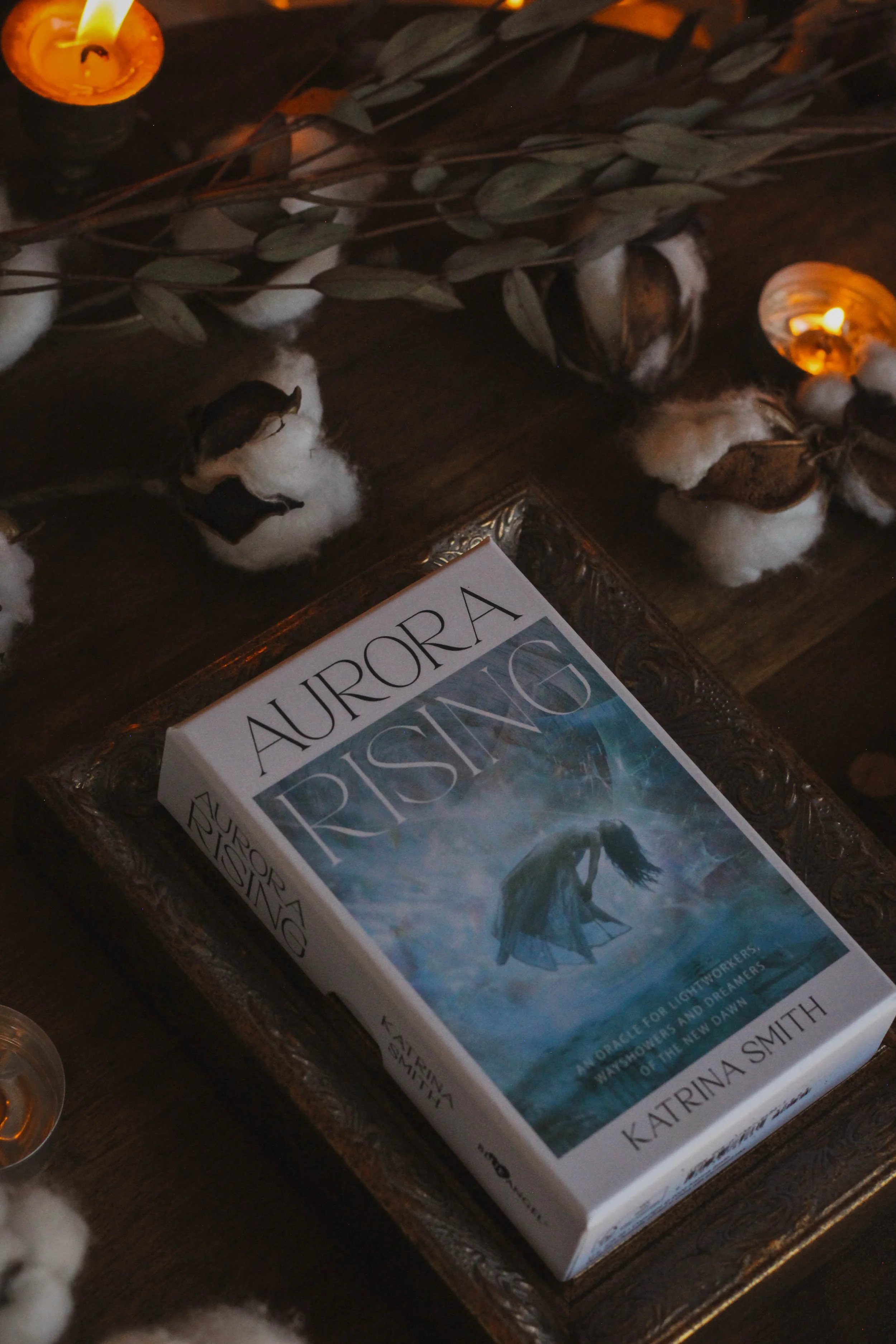
Title: Aurora Rising
Created by: Katrina Smith
Publisher: Blue Angel Publishing
Price: $28.95
Number of cards: 44
Card size: 4.75 × 3.75 in
Box size: 5.5 × 3.5 × 1 1/8 in approx
Guidebook pages:
Purchased or gifted?: review copy gifted by Llewellyn
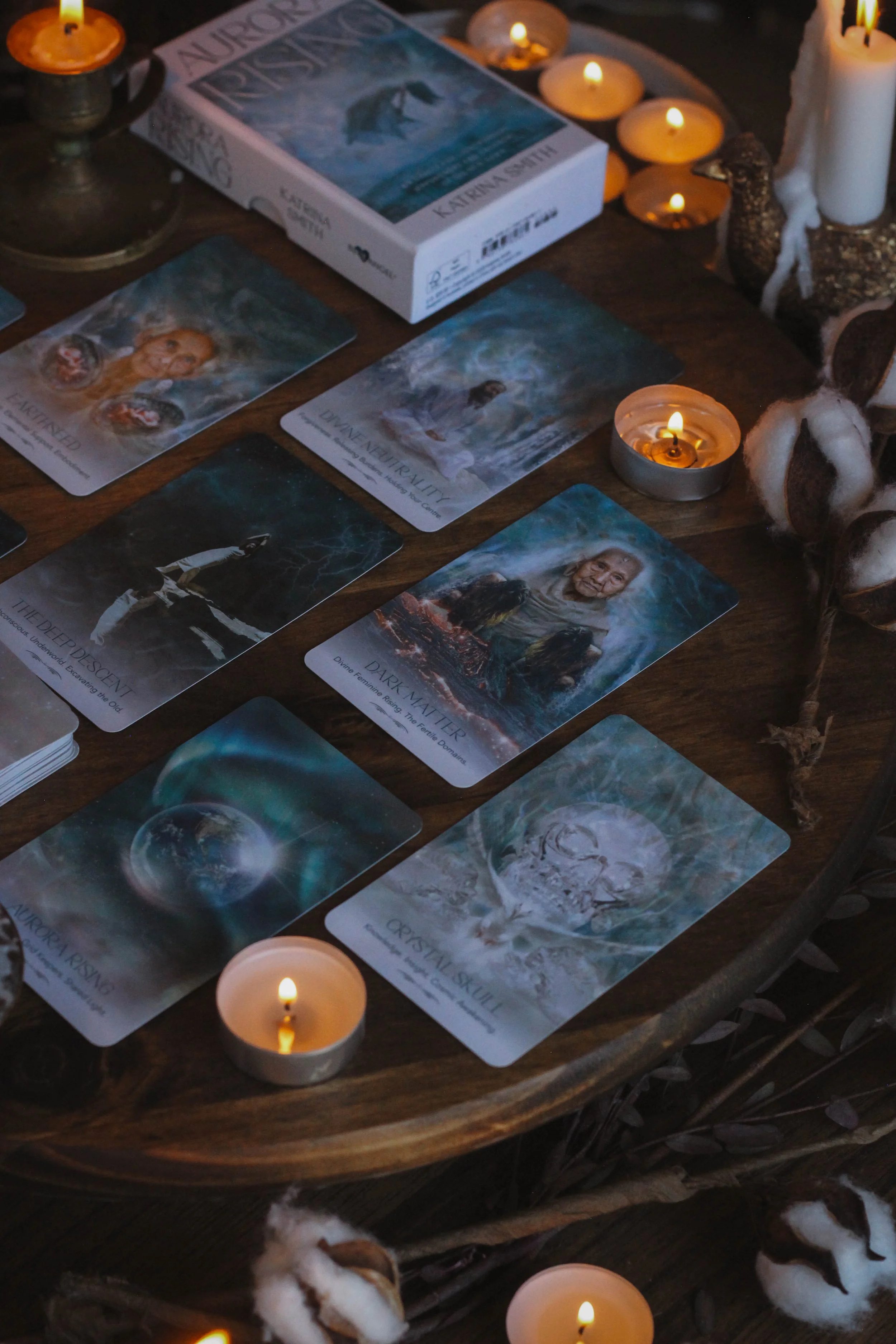
Absolute favorite card: The Deep Descent
Other favorites: (in order from most beloved): Divine neutrality, aurora rising, gnosis, crystal skull, aether, earthseed
Notable detail: new box size for Blue Angel
Season: Summer
Sabbat: Beltane
Sign: Cancer
Element: Water
Deck compliment: The Starchild Tarot Akashic
Collective Pull: Dark Matter

Some of my favorites
First Impressions
The first thing I noticed is that the box is different. I received two Blue Angel decks in this shipment and both of them are in this new size. Not sure how I feel about this. The size of the box is one of the things I’ve loved most about Blue Angel and the fact that they’ve stayed consistent for so long. I’m not sure that I’m loving the new size. But apart from that, I’m really looking forward to digging into this deck. Right away, it reminds me of Rebecca Campbell's decks. The style is very, very similar. Not just in art but the typesetting and even the naming of the cards. Now I love a Rebecca Campbell deck so I’m not complaining. But I’m curious to see how different, if at all, they are. I will say this, the watery blue style is a departure from the often pinkish, green tones of a RC deck. So let’s get into it and be sure to let me know if you end up adding this one to your altar or if there’s a deck you’d like me to review next.
The Packaging
So the box changed. It’s not the same size that Blue Angel has had for at least a decade. It’s much smaller now and the cards are also smaller. I don’t know if this is going to be a permanent choice but like I mentioned previously, I got two Blue Angel decks in the same shipment and they are both the same size. The style is more or less the same though. It’s a two piece rigid box, this one with matte printing. What is a little different is that there’s something printed on the inside of both the top and bottom covers which is unusual for Blue Angel. I honestly can’t think of a single deck from them that I have, with printing on the inside of the box.
Still no gilding on the edges though. Sigh. I was hoping that this new size would bring some gilding too, especially with the price being $28.95. At that price, I’m expecting some bells and whistles. Oracle decks are starting to get expensive. They used to be $18.95 and even cheaper than that and now here this is: a smaller box, smaller cards and no gilding. I would be lying if I said I wasn’t disappointed.
The cards themselves are lovely though. The printing is a matte finish which feels so luxe. It has a really nice smooth texture and the color looks beautiful. The back of the cards feature a pretty minimal image. It’s just waves with some light leaks so nothing super special but it does fit the deck quite nicely. And the cards shuffle well.
One good thing about smaller cards is that they’re easier to shuffle. It’s kind of a challenging thing. A lot of artists prefer larger cards because you can see more of the artwork and a lot of readers feel that way too. But, bigger cards are harder to handle which means they’re more prone to damage while shuffling. I personally like this size of card myself. I think it’s big enough to see the artwork but not so large that I can’t hold them.
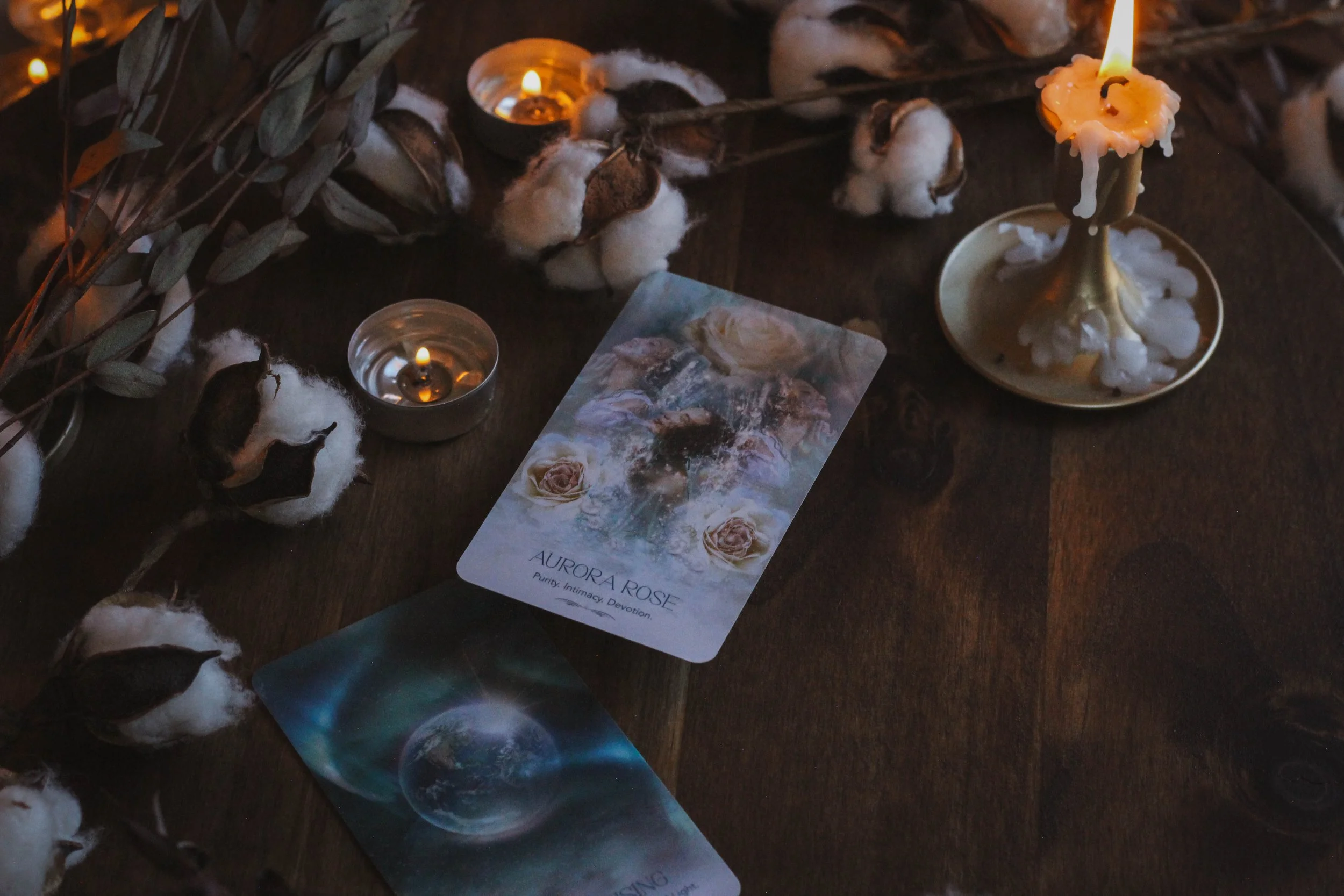
Aurora Rising and Aurora Rose
The Guidebook
The book is small but very pretty and in full color. It’s really calming too. The pages are white with many different shades of blue that truly compliment the artwork. I like it. Inside the guidebook, you’ll find:
An introduction
The Realms of Aurora
Katrina’s Visual Codes
Working With the Oracle
Three spreads
The card messages
Notes section in the back
I really like the section called Katrina’s Visual Codes. I think as a deck creator, at least for me, I’m always working on how to balance the descriptions of the imagery with the card meanings. Having a small section like this gives you a chance to talk about recurring imagery without having to take up that real estate from the meanings later in the book. I think it’s a good idea and one I might contemplate for my own works.
For each card, you get a photo of the card face, the name, keywords and the meaning. There isn’t a description of the artwork. I’ve talked about this in the past: not including descriptions. I think that’s a good thing in most cases because ultimately, what’s needed is the card meaning. Sometimes it's nice to let the reader connect to the imagery without the influence of needing to “know” what each detail is for. So I don’t mind the lack of descriptions especially because there’s a small explanation with Katrina’s Visual Codes.
One thing I do wish I’d see less of, not just in this deck but in all decks, is including a one card spread which is essentially daily guidance. I feel like at this point, most readers know that pulling a card per day is a great way to get to know a deck. I’ve definitely included this in my own decks in the past but I feel like at this point, we need to find something new. Not a reflection on this deck specifically, I’m just putting it out into the universe and maybe saying it for myself as well.
Theme
The author calls this deck “a journey of empowerment and self-discovery.” It’s meant to help you to awaken to your potential and to get to know yourself at the deepest level possible. The watery imagery and that of light, pearlescence and plasma all represent a spiritual awakening and the aura raising its vibration.

My favorite card
The Artwork
I think the artwork is very pretty. I love the blues. This deck is pretty much all blue and watery and calming and I love it. It’s a water energy deck 100%. But, it really does remind me of Rebecca Campbell’s decks. She doesn’t own that style of course but I definitely think it's the most recognizable so it's hard not to draw the connection. It’s also very similar to Danielle Noel’s decks which are very similar to Rebecca Campbell’s decks. It’s gorgeous but the style doesn’t feel especially original.
My favorite card is the Deep Descent. Maybe it's a weird thing but I love mirrored images like this. Everytime I see one, it immediately makes me think of the conscious and subconscious existing as two sides of the same coin. Or it makes me think of stories where someone looks into a mirror and sees themself but the other side isn’t quite the same. Humans are such complex creatures and mirrored images like this illustrate that complexity in my opinion. We each have different parts, different components that make up who we are and while each piece is subtly different from the next, all of it represents the person as a whole. Your past will always be a part of your future. And I guess this image really sums up all of that for me.
“By opening our hearts, we expand our horizons, aligning with the unseen support that surrounds us. We receive the cosmic love of the Aurora, restoring every cell of our bodies and uplifting our vibrant emanation of light. ”
I love the inclusion of the crystal skull. You might not think it's serious enough but I love Indiana Jones and the Crystal Skull. Particularly the part where Cate Blanchett is given the knowledge of the whole universe and quickly it becomes apparent that she cannot hold all of that. There’s something about “not knowing” that really resonates with me. I often talk about a TV show called Obsession where the main character says “Learn to Love the Questions.” I don’t think we need to have the answers to everything. Some things we’re just not meant to know and there’s something freeing about accepting that. Cate Blanchett should’ve accepted that in the movie and so for me, crystal skulls are a symbol of being comfortable with the unknown. That’s not at all what this card means but that’s the beauty of oracles. One card can mean something totally different to another person.
Reading With this Deck
This is definitely an encouraging deck. Every card that I have worked with so far has felt like it's written to be an activation of some kind. I’ve personally pulled mostly cards having to do with opening myself up to my creativity. In truth, I’ve found it a little hard to read with these cards because my creativity has felt diminished this year. The cards don’t call anything out in a bad way by any means. It's kind of like getting a message from an incredibly kind aunt or grandmother who has all the compassion in the world but also knows you’re suffering.
To be very vulnerable with you, I’ve felt like the cards are saying my light is incredibly dimmed and I would agree with that. It’s been a hard year to say the least and I haven’t felt able to create the way I feel called to do. So it’s been really emotional reading with these cards.
I don’t know how else to explain it other than, it’s like these cards see exactly how you’re rejecting your own light and bring that to the surface. It doesn’t feel mean or malicious or even aggressive. They are actually quite beautiful and kind in the messaging. The best way I can describe this deck is to say it feels like water. It feels like it can hold the deepest truths one minute and a shallow, calm current the next.
There’s a lot about this deck that feels like your standard mainstream spiritual deck but it really is quite lovely to work with.

Inside the box
Season, Sign, Element and Sabbat
I choose summer for the season. Summer is usually associated with fire and I do agree with that but when I think of summer, the first thing that always comes to mind for me is water. I think of the ocean, lakes, streams and rivers even though water is traditionally associated with fall. But that’s the thing about these associations. Water might mean autumn to fall and summer to others. Sometimes water is associated with winter too. But for me, water feels most like summer especially because that’s when we need water the most. It's the medicine for too much heat and since this deck looks and feels like a deck of water, I felt summer to be the most appropriate.
I chose Cancer for the sign but my first thought was actually Aquarius. I’m not actually sure why I felt that connection. I guess because this deck has a utopia-like feel to it. But when I really sat with it, Cancer felt more appropriate. There’s this womb quality to this deck. It feels supportive and nurturing, almost like being in a warm bath. I really just get that safe, water association which to me feels like Cancer. And I’m sure you can tell by now that I went with water for the element.
I chose Beltane for the sabbat. At first I wanted to select Samhain. When I look through this deck, I think of the thinning of the veil but then I realized, Beltane would be perfect for that too. We often hear about the veil being thinnest at Samhain but it is also thinnest at Beltane. The two are complimentary energies in this way. Beltane is also associated with water so you’re really getting the best of both worlds.

Collective Pull
Collective Pull
I pulled Dark Matter for you. This card represents acceptance of darkness. Knowing that the dark is where all things are possible. It’s where all things originate and where all things will return. We are often taught to be afraid of the dark because it represents what we can’t see but that’s what makes it so powerful. It holds all opportunities. Think of the darkness of the sky that makes it possible for stars to shine. We need the darkness to allow ALL possibilities of light to come through. You’re being asked to allow darkness to move through you as a way to connect with your creativity and potential. All that you desire will begin in the space without light. Don’t be afraid to look into it and to fill that space with your wildest dreams.
Who is this deck for?
This deck is not your deep, dark shadowy deck or your pagan earthy deck. It kind of feels like a healing retreat in the jungle, worked into a deck of cards. I think visually, if you resonate with the standard mainstream spiritual vibe then this is an easy choice. Especially if you like Rebecca Campbell or Danielle Noel. It looks very much Malibu, Venice Beach, Bali spiritual but mainstream doesn’t mean lacking in depth. It feels like it has mother becoming crone energy. Something that can hold you as you cry and then will help you to dry your tears.
Deck Companion
I chose the Starchild Tarot Akashic as the companion. Almost immediately, I knew one of Danielle Noel’s decks would be a good match. The styles are so similar as well as the symbolism. I even think some of the writings carry a similar vibration too so it felt like a natural fit. I also tried the Moonchild tarot which I didn’t like. That combination didn’t feel like it had the same flow and watery energy as the combo with Starchild.

Back of cards

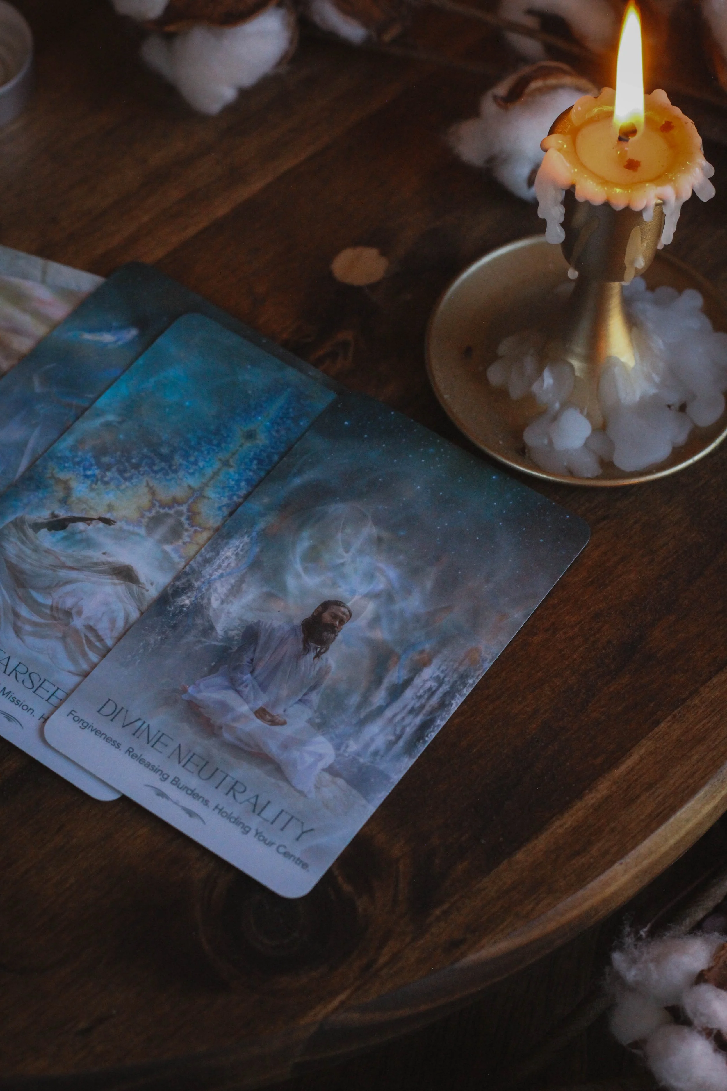








Inside guidebook