The Sacred Woods Oracle Review
This page may contain affiliate links which may allow us to collect a commission when you click and make a purchase through the links on our site. There is no additional cost to you for doing so.
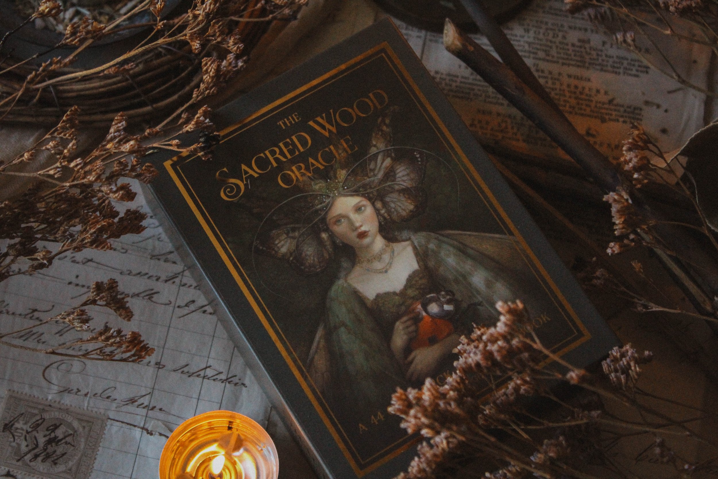
Title: The Sacred Woods Oracle
Art by: Annie Stegg Gerard
Author: Annie Stegg Gerard
Publisher: Independent
Number of cards: 44
Card size: 5 x 3.5 in
Box size: 5.5 x 4 x 1.5 in approx
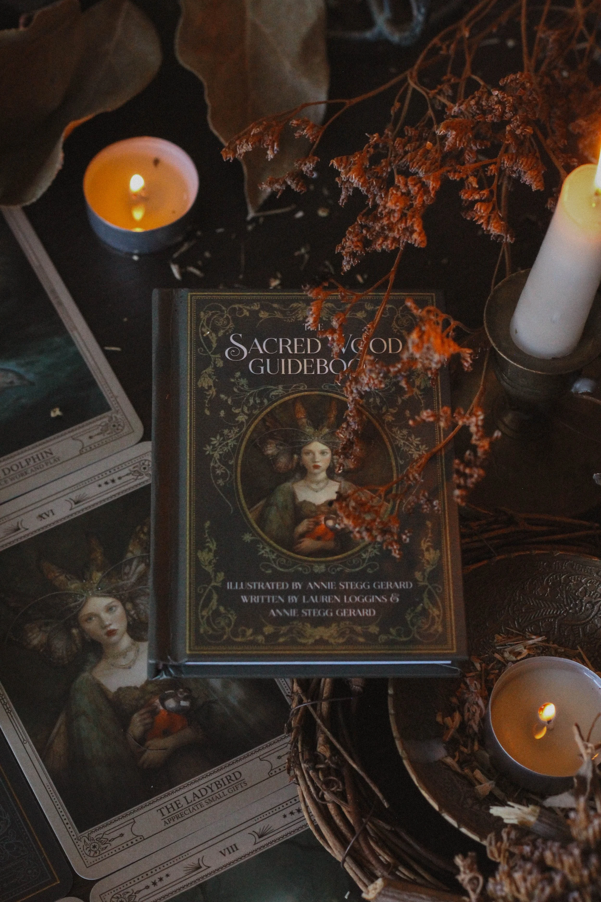
Guidebook pages: 93
Purchased or gifted?: Purchased
Absolute favorite card: Moon Dancer
Other favorites: (in order from most beloved) Stormy Seas, Toodstool Dane, The Heron, The Frog, The Lyre, The Snail, Owl’s Wisdom, Compassionate Heart, The Fern, The Dolphin, The Serpent Queen
Notable detail: Hardback Guidebook
Season: Spring
Sabbat: Imbolc
Sign: Pisces
Element: Water
Tarot Deck compliment: Pagan Otherworlds Tarot
Collective Pull: The Snapping Turtle

With tarot companion
First Impressions
I saw the Red Headed Witch’s post about this deck and went immediately to purchase it. For one, I’m a fan of Annie Stegg Gerard and would love to have her illustrate a deck for me one day. Her style is so earthy yet watery and really moody. So I didn’t hesitate to purchase it when I saw it. The deck is a gorgeous quality and of course she brings her artist eye to the whole project so it feels very luxe. I love the dark green and gold and overall, I’m just really impressed. Of course there’s tons of photos you won’t want to miss so be sure to read all the way through, checking them out as you go along. Let’s dive in.
The Packaging
The box is gorgeous. I love this deep, dark, moody green. It has a bit of grey and brown which gives it a really nice smoky, dusty look. There’s gold foiling on the face of the box which is also toned down so it's not an overwhelming, tacky like gold. You can find the same gold foil on the back of the cards which features a crescent moon and sunburst motif.
The inside of the is lined in a really nice starburst pattern which reminds me of this hotel in New York called The Maker. In fact the general moodiness and tone of this deck reminds me a lot of the Maker hotel which sells their own tarot deck by the way.
The notable detail is the hardcover guidebook which is a nice touch. I love reading and I really prefer hardcover books even though they cost extra. So my heart does a little leap of joy every time I see a deck with a hardcover book. I need to convince my publisher to let me do hardcover because it really amps up the luxury factor. The guidebook is full color with nice large images of the cards inside.
The cards are firm but flexible and relatively easy to shuffle. Sides aren’t gilded which I do mind in this case. The gold foil is featured enough around the box and back of the cards that I feel like the sides needed to be gilded too. Aside from that though, I’d say the packaging is pretty close to perfect.
The Guidebook
As beautiful as the book is, it doesn’t really offer much. There’s a foreword and then the card meanings, that’s it. No spreads, nothing on how to use the deck, no background, nothing.
For each of the cards you get a short phrase, a message, a small paragraph about the card and the extended message. My honest opinion is that all of that could’ve been one paragraph or housed under one heading. I don’t think it added anything to break it up into sections.
This is what I would consider to be an art deck for sure. By that I mean, the creator is more an artist than a writer. A lot of artists have not wanted to partner with writers in more recent years, choosing to write their own books instead. I can see the benefit in that but I also see the downsides. Taking on a deck is a huge project. Having to write and do the art work is even worse. There are so many times I wanted to illustrate a deck of my own but I choose not to because my strength is in writing and it would take an enormous amount of time to do the artwork when I know my bigger gifts lay elsewhere.
That’s not to say artists shouldn’t try to write. No no. If you want to do something, I am the first to tell you to go for it. But I do believe perhaps this project would’ve benefited from a writer. I know you should trust your intuition and all that but frankly, there’s nothing wrong with wanting some direction or advice especially when you’re just getting started. Annie Stegg-Gerard is such an amazing artist and if this deck had a really strong book, it would be a 10/10. It is an amazing art deck though; it looks beautiful.

Some of my favs
The Artwork
And now the star of the show… the artwork which is obviously the best part of this deck. It's gorgeous hands down. Annie’s art is truly something special and magical. It's earthy, whimsical and dark without feeling heavily occult.
Moondancer is my favorite card of the deck. I love how peaceful the girl looks, dancing in her flowing dress. Its images like this that make me think of water and ease and grace. Another favorite is Stormy Seas featuring this sea dragon thing and a mermaid. There’s a lot going on, it may even be chaotic but still feels really peaceful. In fact, just about every image feels serene.
“Unlike tarot’s structured system, oracle decks offer a more fluid approach, allowing each card to present its own unique message and meaning.”
I feel like I’ve stumbled upon some magical creature in the woods in every card. Like I’ve been fortunate enough to see something most never will. It gives the whole deck this feeling of whimsy and playfulness and yet it feels very mature. I could easily see any of these images hanging up on the wall. So the art feels approachable to someone who’s curious about oracle decks but isn’t super into witchy things.

With Tarot Companion - Pagan Otherworlds Tarot
Reading With this Deck
So this is definitely another deck that I would say is very art forward. For me, this was a purchase because I love the style and I love the artist but I’m not getting a lot in the way of impactful meanings. That’s not to say it hasn’t been fun reading with this deck but I don’t find it to be especially deep or feel like it's told me anything too meaningful.
I was talking to my friend Matt who is also a deck creator just a few weeks ago and we were discussing how decks are just a bit predictable now. So many people make decks these days so you can really see how many meanings are pretty repetitive. And before anyone comes for me or Matt, both of us have said the same thing about our own decks and were encouraging each other to think outside of the box moving forward.
I’ve found this deck to offer the same ole things like wisdom, patience, rest, boundaries, etc while reading with this deck. It's always great to have these reminders but I find myself just wanting something more. Having said that, you all know that I take a lot of photos and one of these days I swear I will be back on social media. This is definitely a deck I will cherish for my photos moving forward.

Collective Pull: The Snapping Turtle
Collective Pull
I drew the Snapping Turtle for you. This card advises you to hold firm and protect yourself. To have courage and to defend your values, choices and way of life. Sometimes that means having a bigger voice even when you feel small. That means you have to stand and fight rather than choosing the easier option to run away. Take a deep breath and respond with intention rather than just fear. Ask yourself what you need at this moment? Ask yourself what you need to feel brave and strong against your obstacles? And then embrace that. Turtles are small but mighty and you can be too.
Season, Sign, Element and Sabbat
I went back and forth between spring and winter. It would seem obvious to choose spring since it's so lush and rich with plant life but the tones are so much darker and moodier than I felt spring can offer. The vibe feels more like winter to me but ultimately I chose spring; I would just say spring at night.
I went with Pisces for the sign. I kind of wanted to lean towards Capricorn since it's so earthy but there’s a dreamy, fantastical quality to it that’s Pisces all day long. There’s this feeling of getting lost in a mystical world and no sign knows how to daydream better than Pisces does and if ever there was a sign to get lost in Narnia it would be them.
I went with Spring for the season but stayed with Imbolc for the sabbat. The darker tones really just feel like that time of the year. So much of this deck feels like it occurs at night and I really wanted to honor that. Beltane wouldn’t have captured its energy and depth and that’s the only spring festival that could remotely work in my opinion.
Finally, I chose water—no, not earth—for the element. Earth would’ve been too easy, too obvious when you see so much movement and grace and flow within the artwork. Water also features quite prominently throughout, not just in water itself but moons and feminine wisdom and connection to nature and owls and all of these luscious symbols that correspond to water energy.
Who is this deck for?
Obviously if you’re a fan of the artist then this deck is a must have. It's gorgeous even if you aren’t super deep into reading cards. I also think this is a strong deck for professional readers who can really expand upon the meanings without too much guidance. It's stunning so it will for sure be a crowd pleaser and I think professionals can do it the most justice when it comes to reading it well.
I would also recommend this deck for the aesthetic queens. The ones who are doing it for the gram and need something gorgeous to incorporate into photos.
If you are just getting into spiritual concepts then this deck might also be great for you. The meanings are pretty basic, foundational spiritual stuff so if you’re a beginner with all that then I think you can get good value.
Tarot Deck Companion
I’m working off of a theory with this one because I don’t actually have it just yet but US Games has a tarot deck coming out at the end of this month (May 2025) called Magical Hours Tarot which I feel might make a strong companion. I tried a bunch of other tarots but couldn’t find something that I felt strongly enough about. I’ve anxiously awaited the release of Magical Hours Tarot and really just felt like it would be perfect but I’ll have to let you know as soon as I get it in.
I did grab for Pagan Otherworlds Tarot just before taking the photos. I really like how it looks to have tarot and oracle together in a photo so I grabbed something on a whim but then I LOVED the pairing. They actually went together so well. Pagan Otherworlds is pricey and while beautiful, I wouldn’t rush out to get it if you don’t have it already. But if you do, it really does go together quite well.
Thanks for reading all the way through. If you found this review to be helpful, informative or entertaining in any way, please be sure to leave a comment down below. It really helps me know what you’re enjoying so that I can provide more content based on what you love. In the meantime, please enjoy a variety of photos from this deck.
And of course, if there is something you’d like me to consider reviewing, please comment below or email me at hello@spiritelement.co


Guidebook


Watery cards