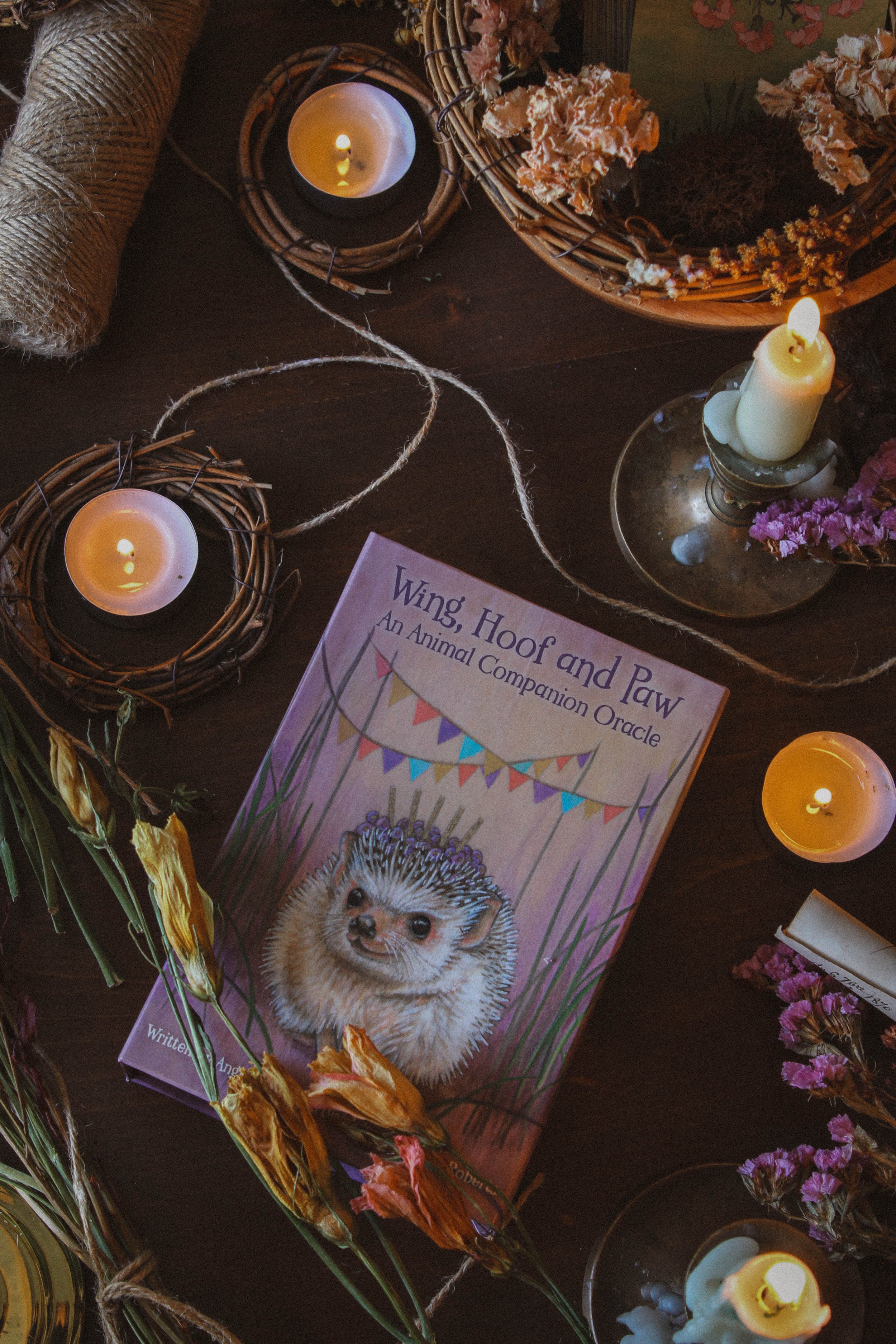
Wing, Hoof and Paw - An Animal Companion Oracle Review

This page may contain affiliate links which may allow us to collect a commission when you click and make a purchase through the links on our site. There is no additional cost to you for doing so.
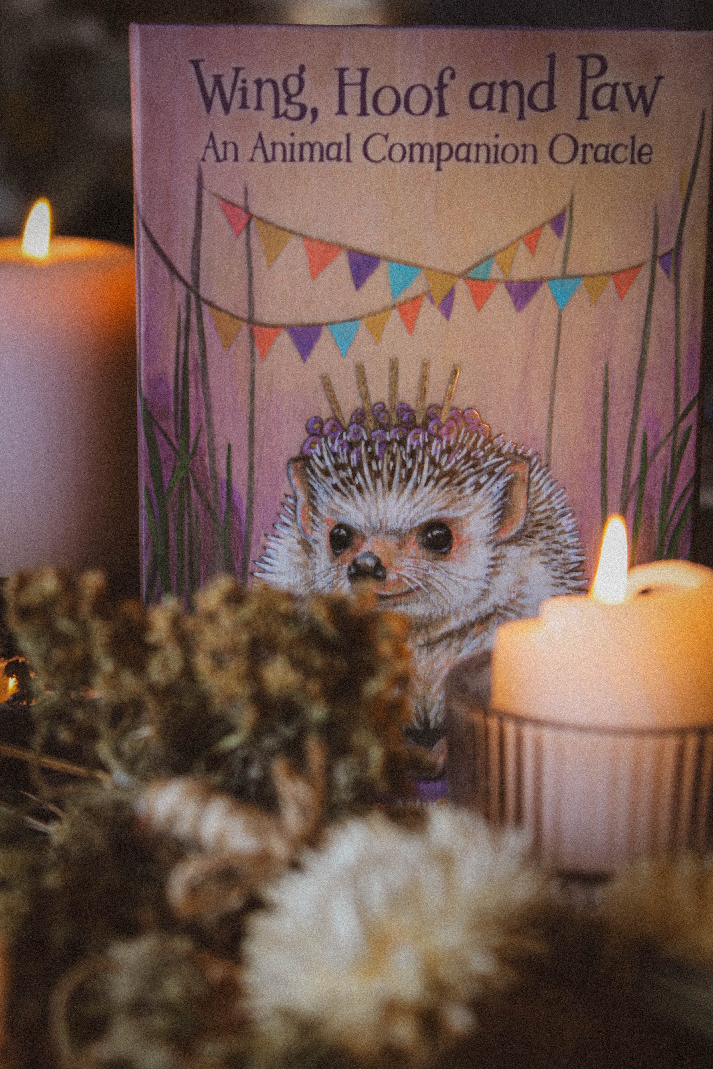
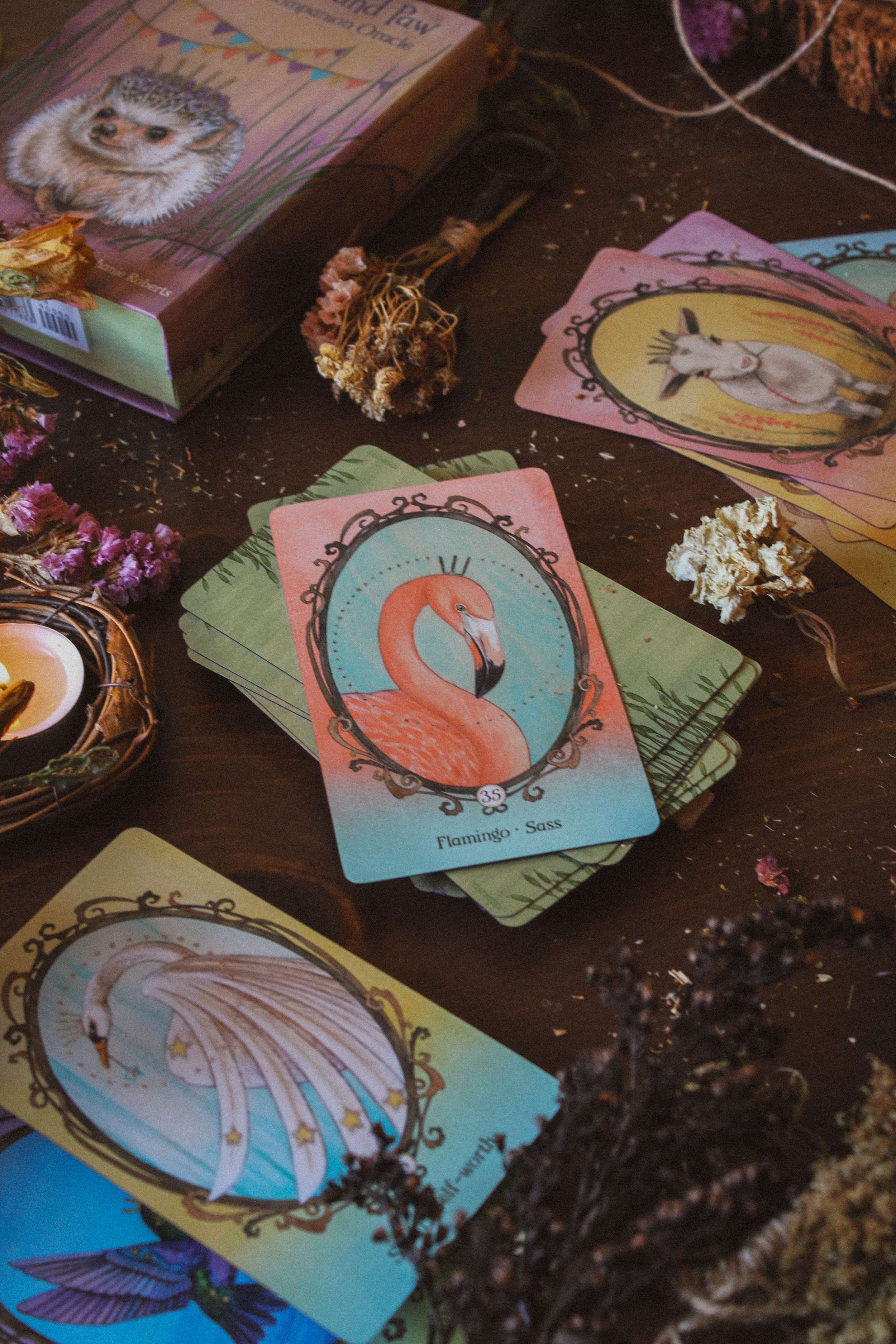
Created By: Angi Sullins
Artwork by: Stephanie Roberts
Publisher: U.S. Games Systems
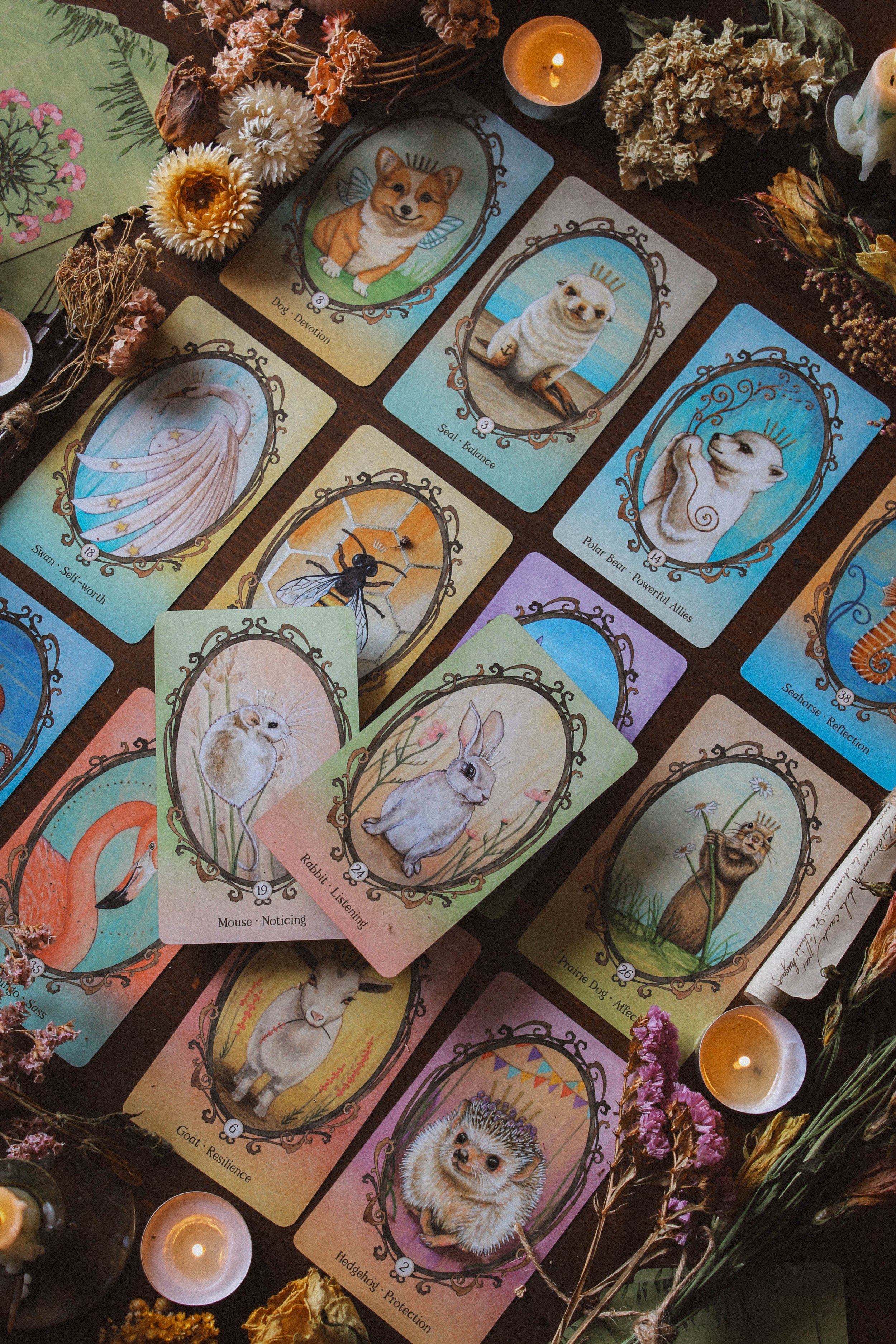
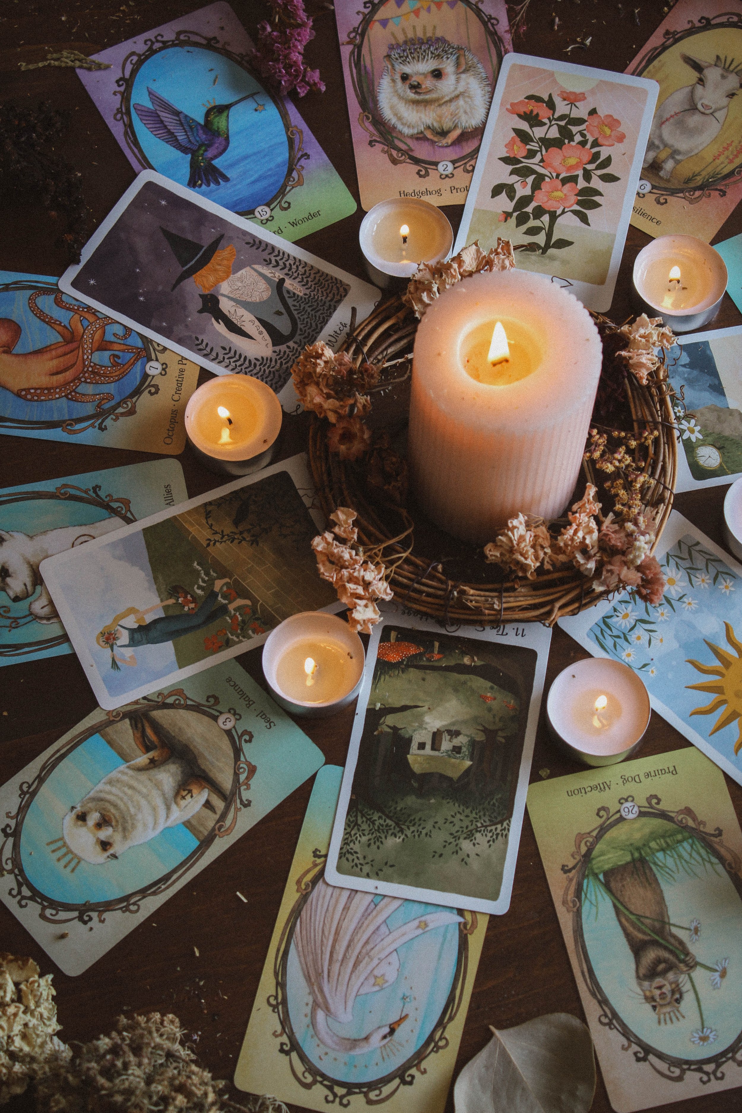
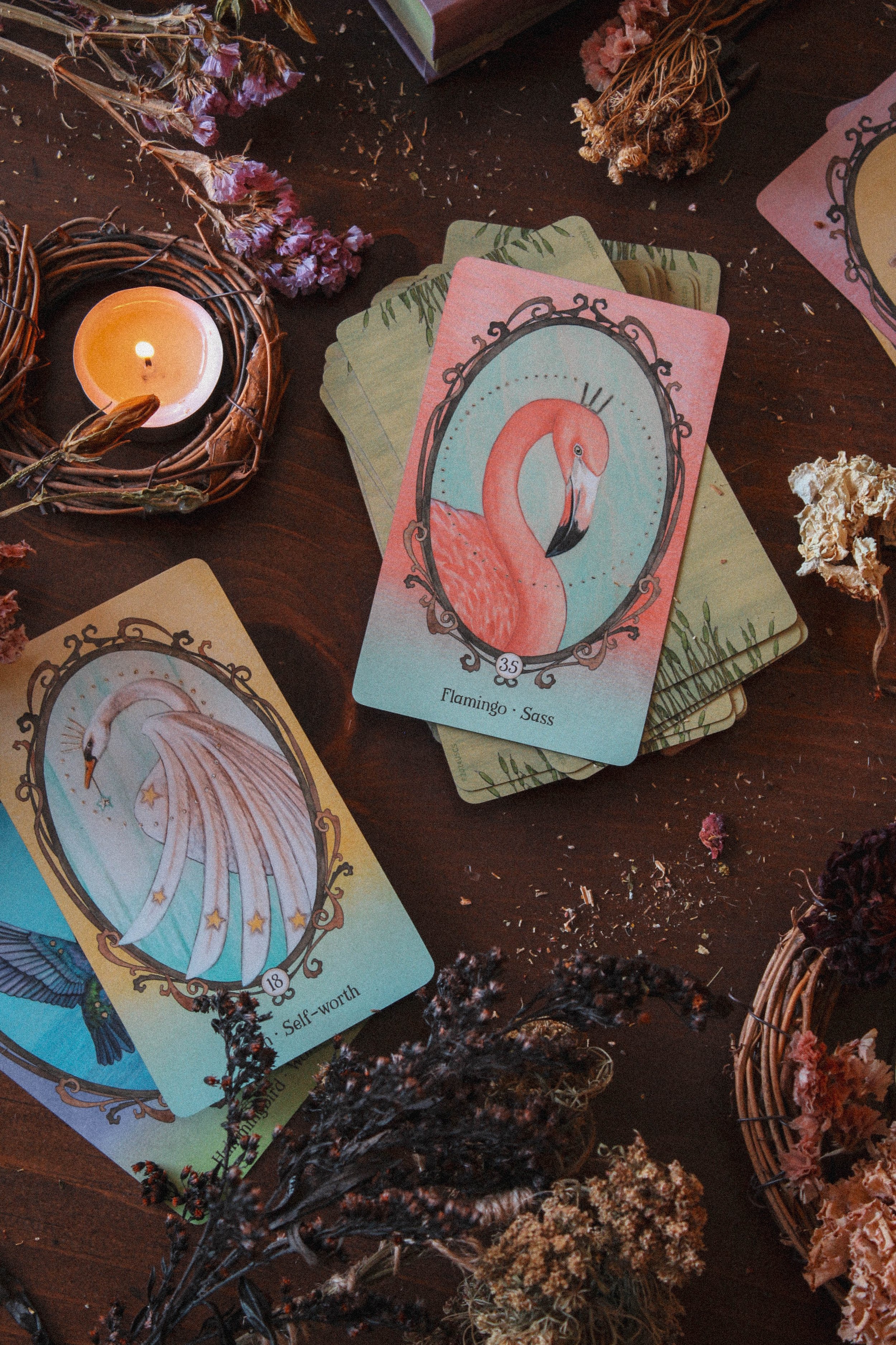
Number of cards: 44
Card size: 5x3 inches in
Box size: 6.5 x 4.5 x 1.5 in
Guidebook pages: 108
Purchased or gifted?: Review copy provided by U.S. Games Systems
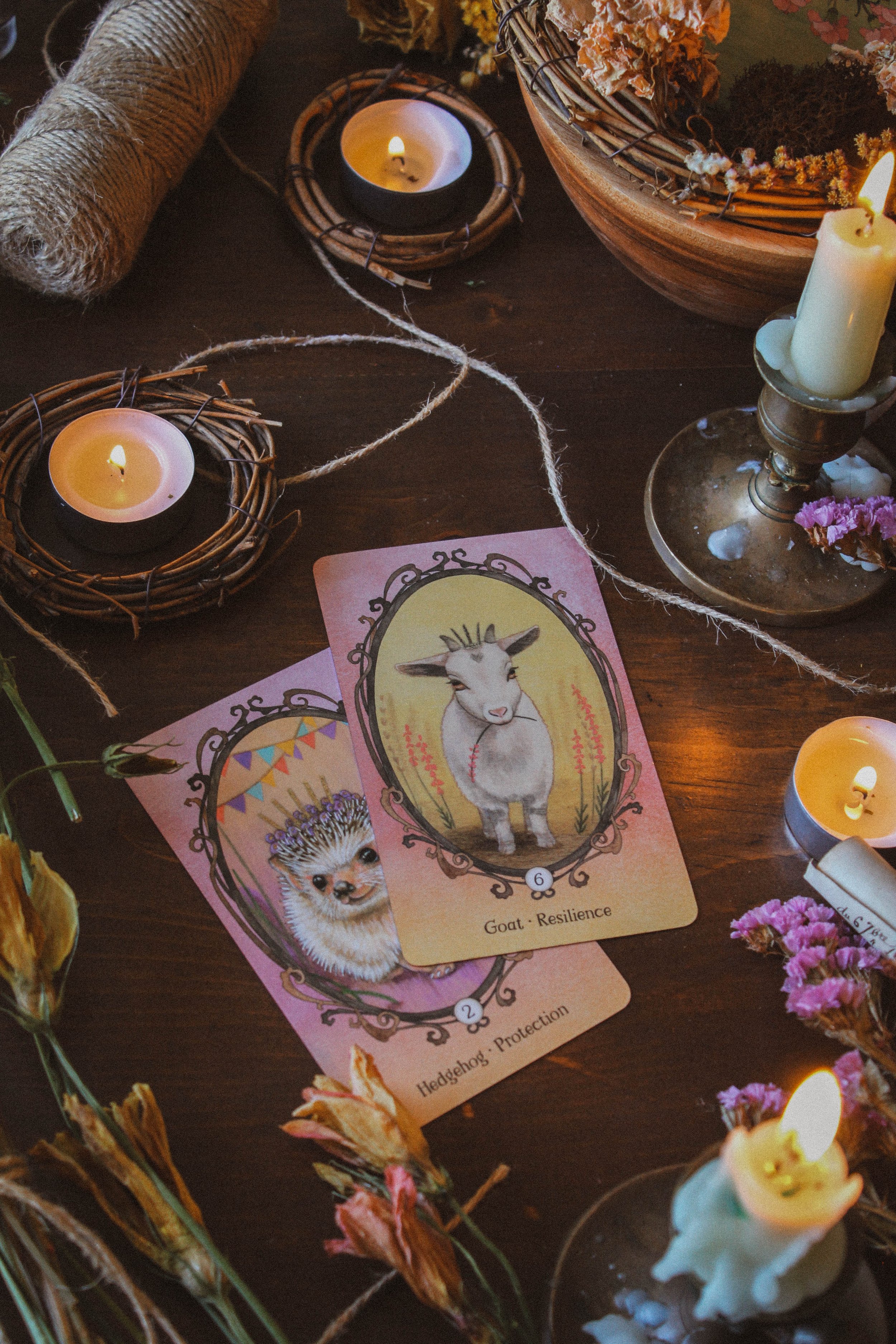
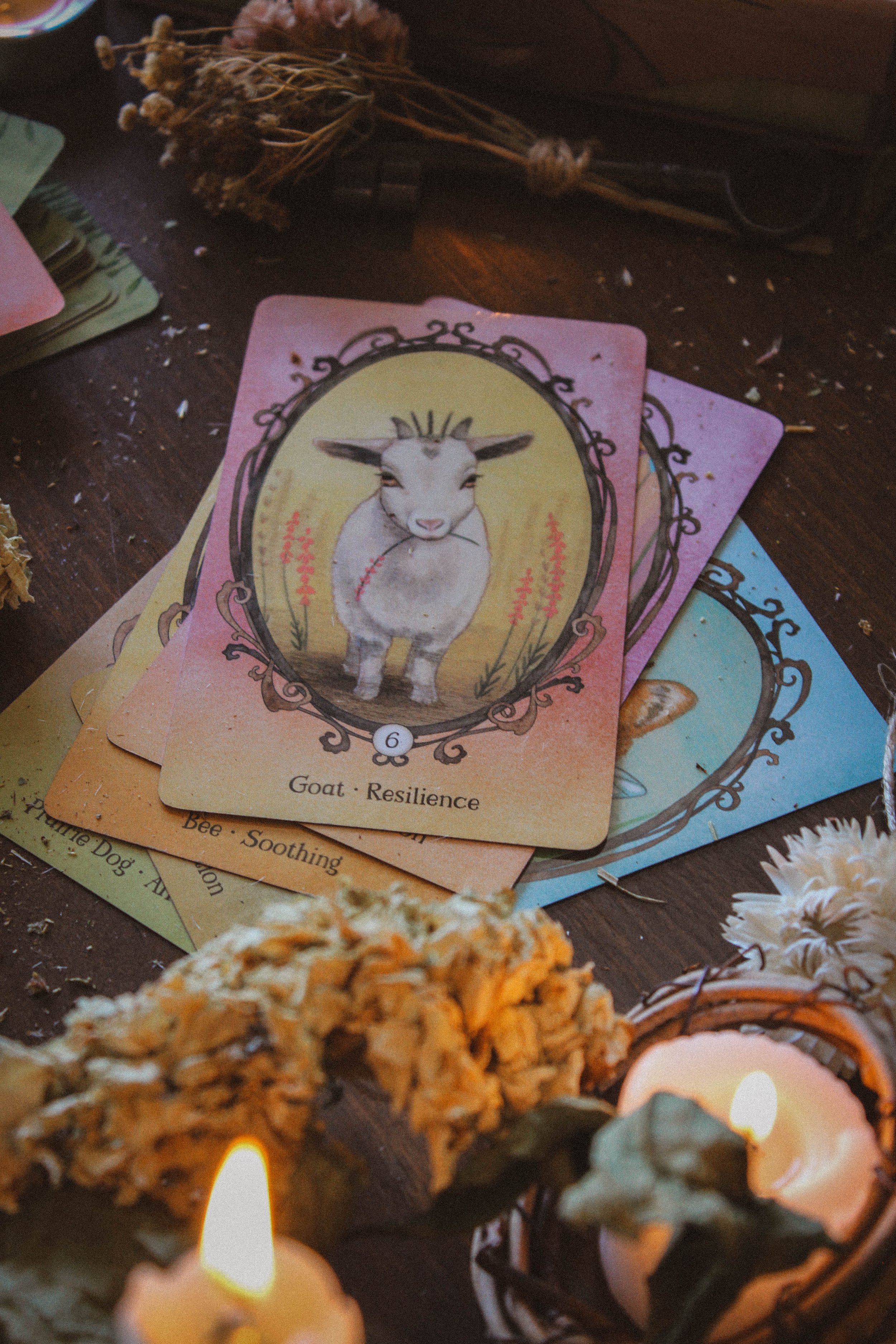
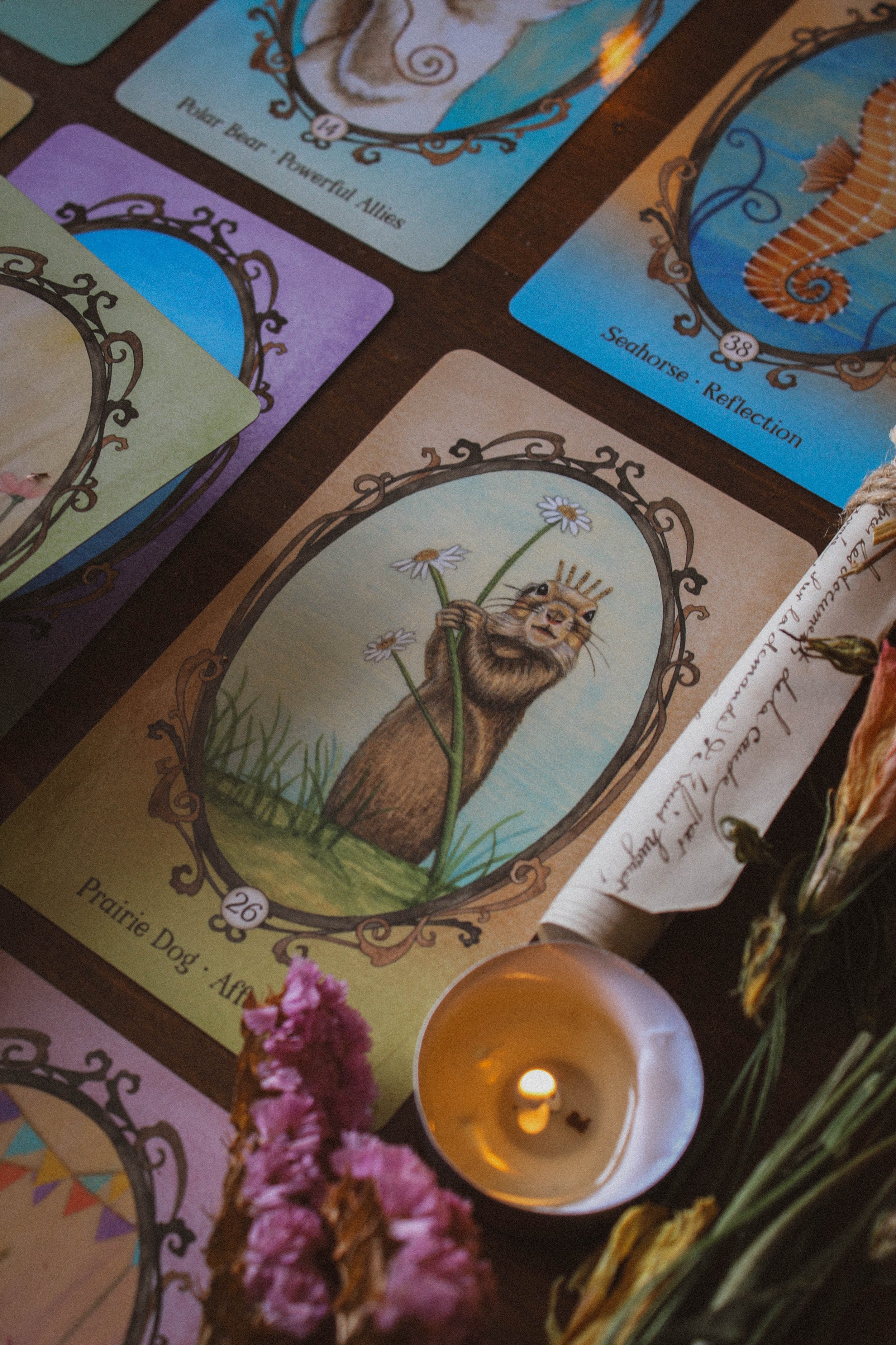
Absolute favorite card: Prairie Dog - Affection
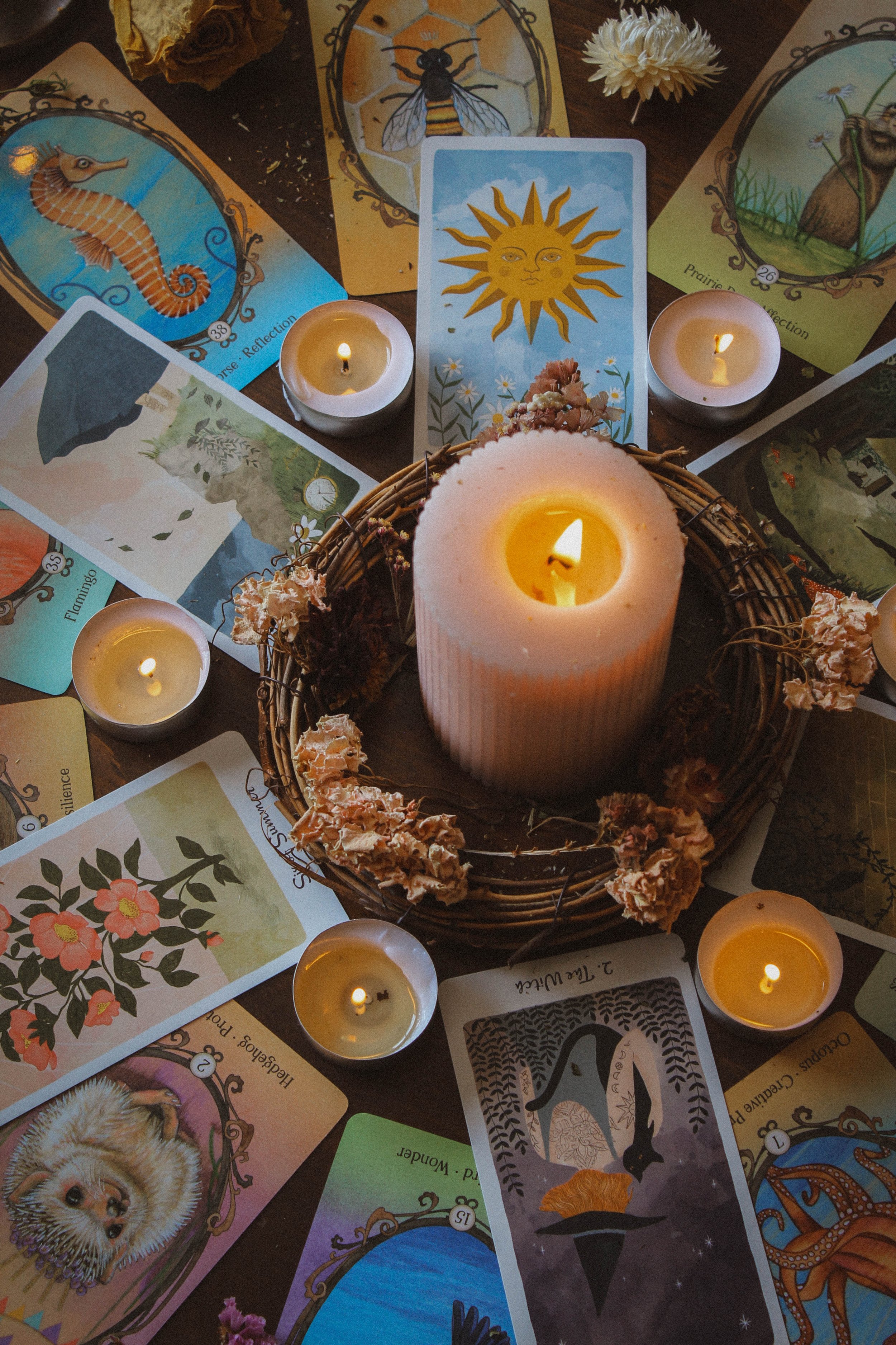
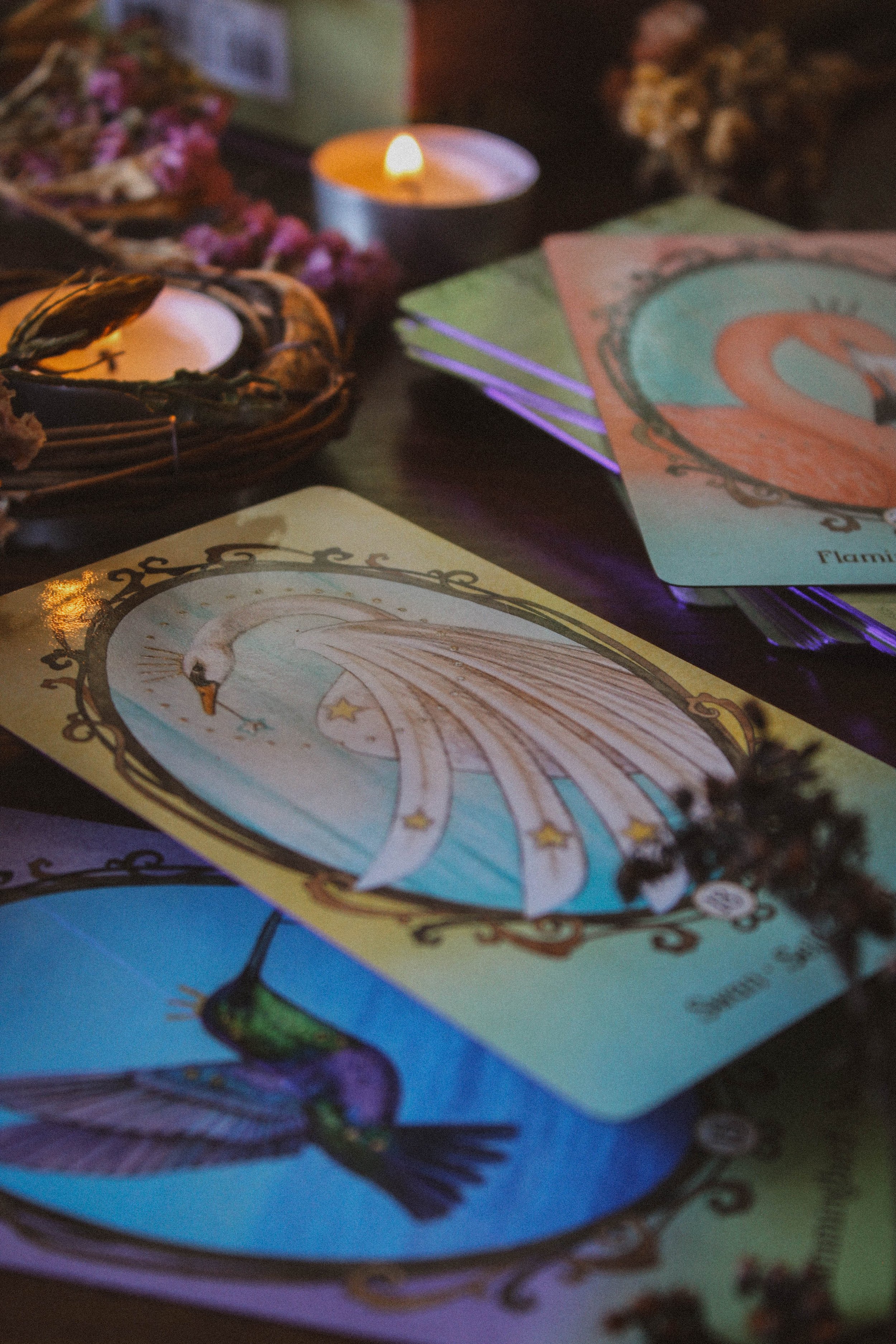
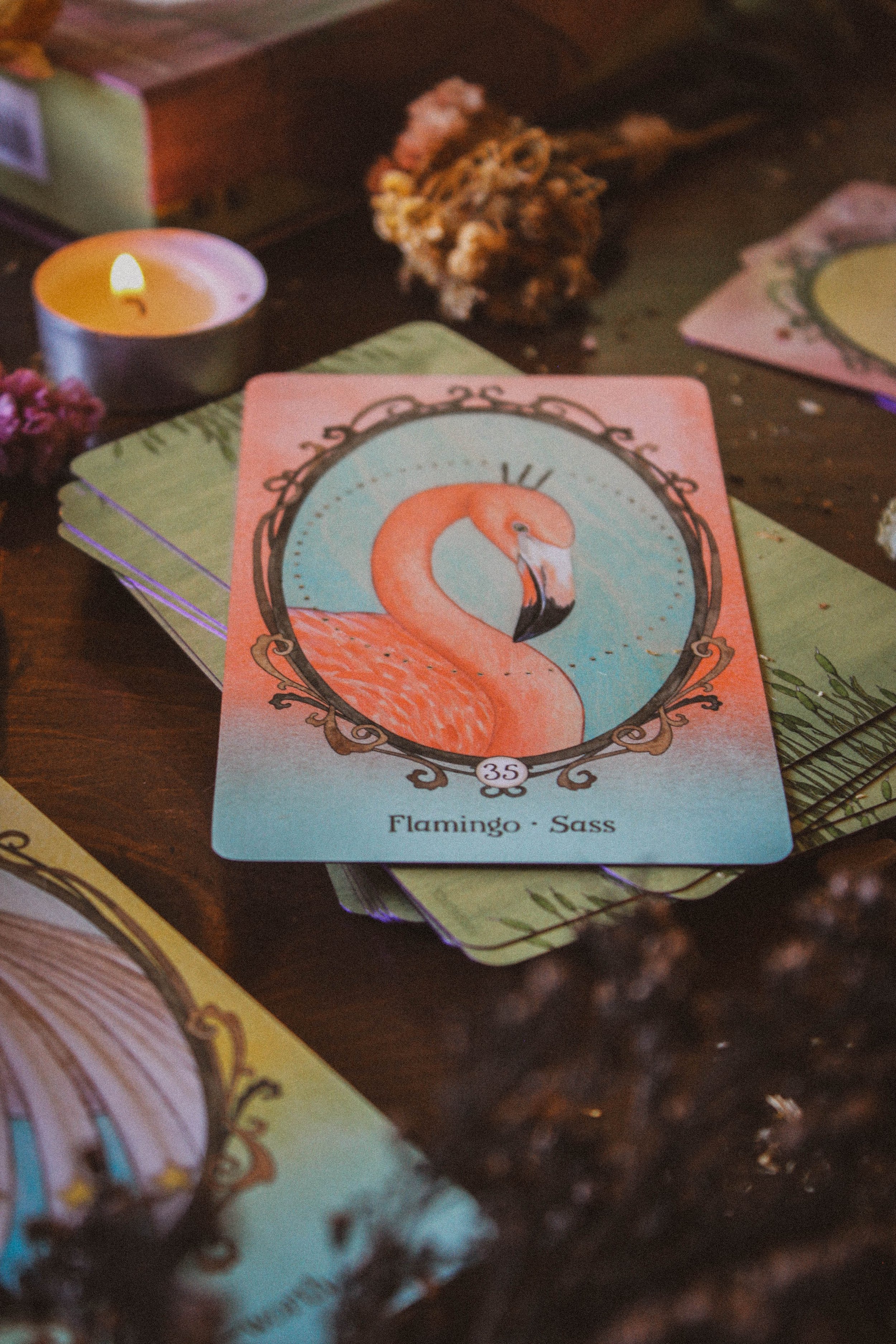
Other favorites: Bee - Soothing, Polar Bear - Powerful Allies, Hummingbird - Wonder, Octopus - Creative Problem Solving, Mouse - Noticing, Swan - Self-worth, Seahorse - Reflection, Goat - Resilience, Dog - Devotion, Seal - Balance, Rabbit - Listening, Hedgehog - Protection, Flamingo - Sass
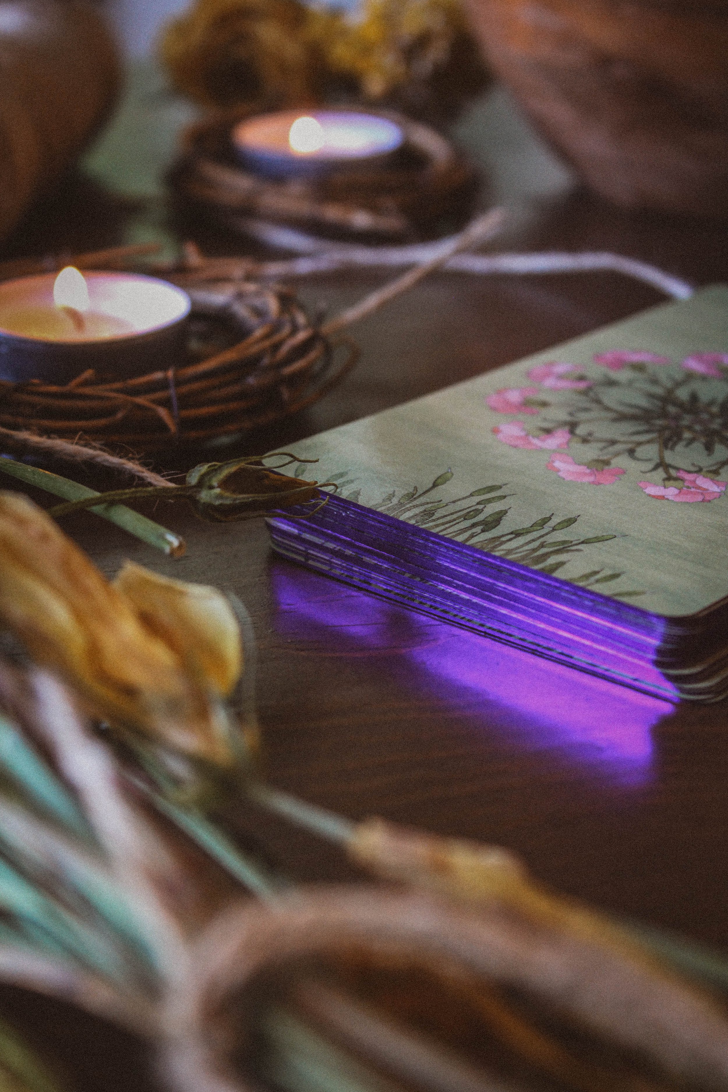
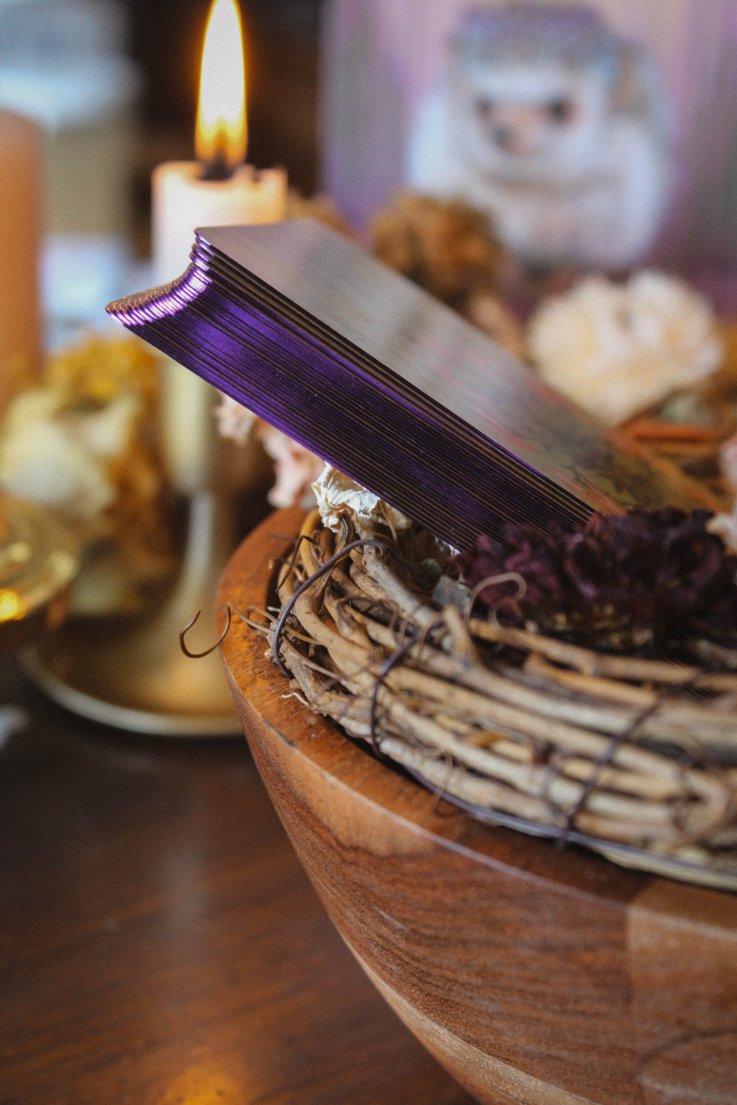
Notable detail: jewel toned purple gilding
Season: Spring
Sabbat: Ostara/Beltane
Sign: Taurus and Cancer
Tarot Deck compliment: The Harmony Tarot

First Impressions
My opinion is somewhat biased because I love Angi Sullins’ decks. I think she has an incredible writing style and a unique perspective. There are some things I feel are missing from her decks, or at least the ones I have, like spreads for example but really, you can’t go wrong with one of her creations. This deck is just so sweet and endearing. I found myself completely melted by the cuteness of these little creatures. I love animals and regardless of the art style or even packaging, I found I was completely captivated by this deck just because of the creatures. If you love animals, I’m not sure it's possible not to like this deck.
The Packaging
The packaging is lovely. The box is sturdy with a magnetic closure book style lid. There’s nothing fancy about the box but nothing wrong with it either. It just doesn’t make noise when you open it or have luxurious foil but that’s totally fine. It's really just sweet and gentle. It's the kind of box you can imagine having with you for a very long time. I love the bells and whistles, you know this but sometimes you don’t need things to be over the top. This box is exactly what you need, nothing more or less. I will say this, it’s strong. I accidentally put all my weight on the box and thought I had crushed it but it was completely fine.
The inside is full color and it has a nice space to hold the cards including the ribbon to help pull the cards and book out of the box. The most notable thing about the packaging is the jewel toned purple siding on the cards. It's quite striking, especially against the pastel tones featured everywhere else. I don’t know why purple was the choice but I love it. You open this soft, muted box to find this brilliant surprise and I think that’s setting the tone for the deck overall.
The Guidebook
The guidebook is full color with big images of the artwork next to each interpretation. I love this for two reasons. For one, sometimes it's hard to tell which card is which in the guidebook. This isn’t really a problem for oracle decks but in tarot decks, sometimes cards look too similar or only have Roman Numerals and no names which can be a little confusing if it isn’t obvious that it's a wands card versus swords for example. There’s plenty of new creations and while the creator may have thought it made sense to their brain, it doesn’t always translate well. As an author, I’m guilty of this too. You think an idea is great inside your head then other people use it and you realize it didn’t make sense at all. It’s not a dig, just the reality of being a writer. All this to say, having a photo really eliminates any confusion. You can see the photo and know you’re on the right page.
The second reason I love to see the card image inside the guidebook is because it's often bigger than the card itself. Which means, you can see some of the more subtle details. Most images are layered and some of that detail can get lost on a smaller print size. With a large enough book, you’re able to reclaim some of that imagery that might otherwise go unnoticed. And the more imagery you have, the more detailed your reading can become. At the very least, it gives you more to think about and consider.
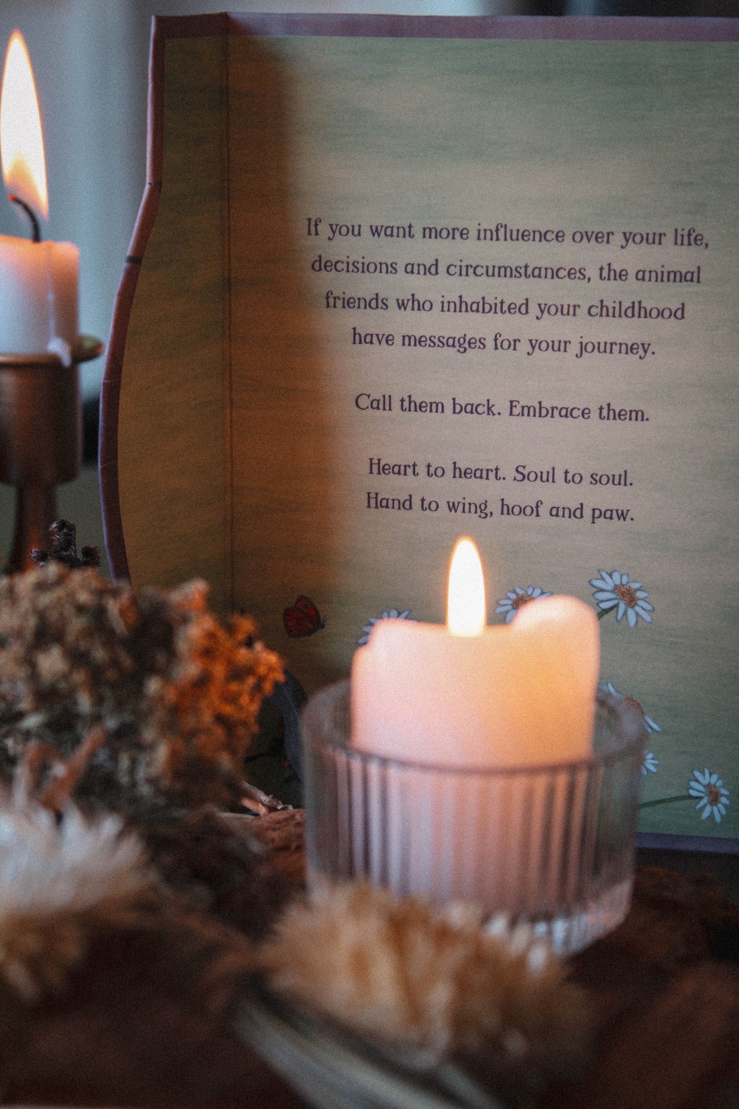
There are poems spread throughout the book as well as an introduction and how to use the deck. There is a note about using three card layouts but that’s it in terms of spreads. I have often wished Angi would include spreads as I think she would create some truly magical ideas. And of course each card has an interpretation. That’s pretty much it when it comes to the guidebook. I do feel like this guidebook could step it up some. I think about some of the guidebooks I’ve gotten recently and how jammed with information they are and I think that’s more aligned with the new normal. I would’ve loved to see something about inner child magic since this is a deck about reconnecting to your childhood imagination or a spread for developing a relationship with an animal or journal prompts, something like that. Just a little bit more than the interpretations themselves.
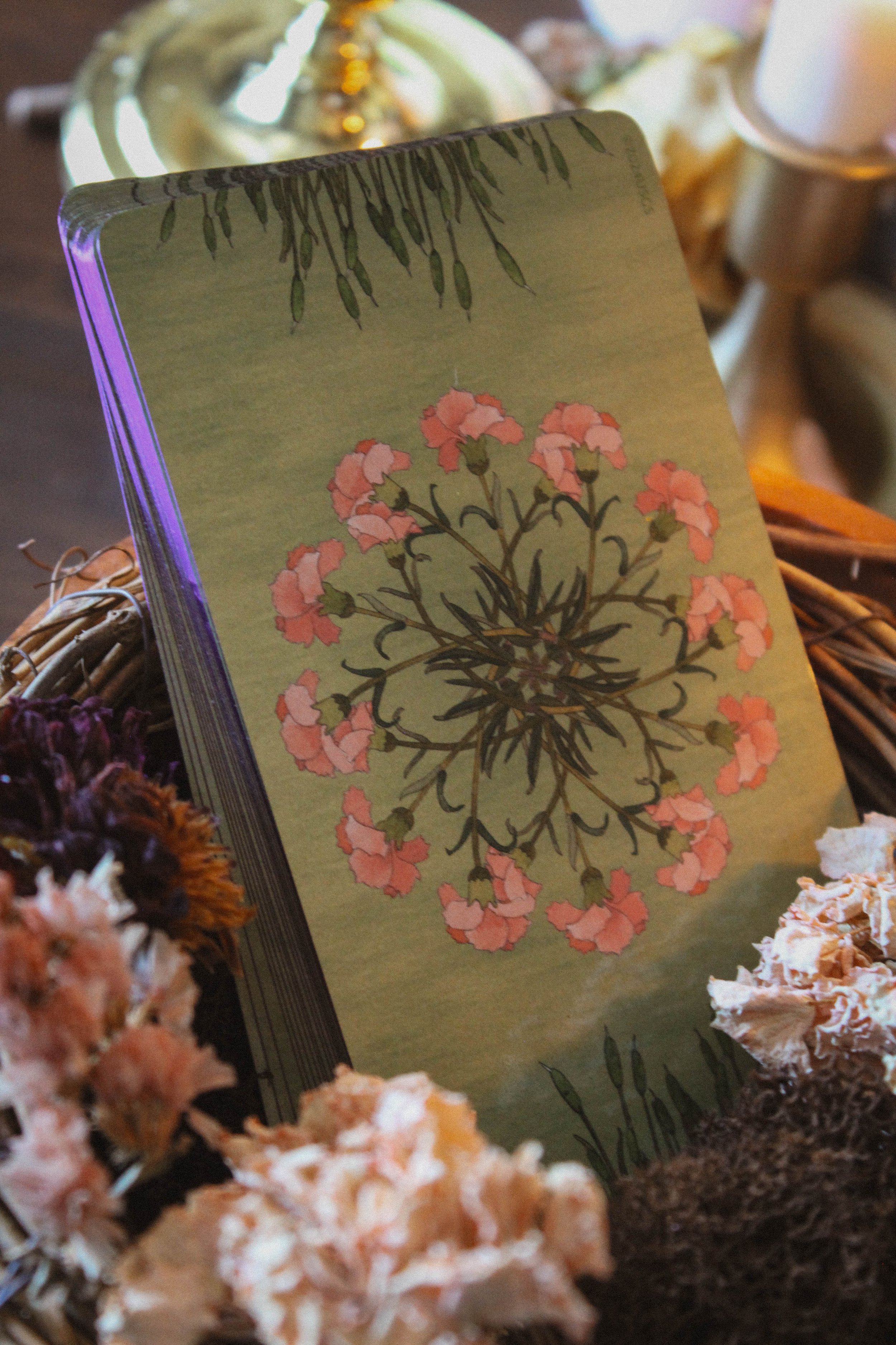
The Artwork
The art is so cute. A lot of the animals are babies which makes this deck all the more gentle and sweet. The color palette is really soothing. All of the tones are pastels and quite soft and the style itself looks like it was done in crayon which really speaks to the youthful quality. But the artwork doesn’t feel like a kid drew it at all. It’s still very well done and you can tell there’s a lot of skill. My favorite part is probably the picture frame you see on each card. They remind me of period dramas where someone might carry a small oval painting in a gilded frame of a sweetheart or beloved back home. And I think that really speaks to the theme of the deck which is reclaiming those childhood memories and imaginations. The frame makes it feel like you’re looking at a memory. I don’t know if that was the thought process or not but I’m choosing to believe so.
“I use the term “the little one within” to refer to your core personality, formed in childhood.”
My absolute favorite is prairie dog because it reminds me of the prairie dogs that dug endless tunnels in the backyard when I was a kid. You’d see them peak up above the ground from time to time and while they annoyed my parents, I absolutely loved seeing them. And in fact, all of my favorites from the deck represent memories or connections I already had. Hummingbird for example is an inside thing between me and my mom. Swan represents a pretty powerful and recent synchronicity for me. Seal really speaks to growing up in Los Angeles (you’d know what I mean if you’re from here) and I have bee hives in my backyard. I feel like you can find an animal that you love in this deck with ease. Continued below…

As for readings, I was pretty surprised by my first reading which was an interview of the deck. I guess I expected it to be quite supportive? Not that it wasn’t but I felt a quiet challenge in my reading. It told me to reach higher, do more, expect more, and believe in my potential. I guess I was expecting a lot of “it's going to be ok” or “take time to rest and play.” Instead, I got a kick in the butt that said I can accomplish way more than I give myself credit for. It was accurate, just not in the way I was expecting it to be.
Season, Sign and Sabbat
I felt the season had to be spring. I think early spring is probably the best time but spring in general also feels pretty darn good. The bright hues and pastel tones really remind me of colored easter eggs and baskets and of course the baby animals bring in a lot of that energy too which is why I selected Ostara for the sabbat. But I couldn’t overlook Beltane as you tend to see a lot more animal activity during that time.
I chose Taurus for the zodiac sign. I chose that before I even opened the deck. I don’t even think of Taurus energy as being naturally corresponding to animals but there was something about the deck that really made me think of May. I think I really associate the colors in this deck to spring flowers and that makes me think of Taurus. So in truth, there’s no real energetic reason for me to select Taurus. It's really just that to me, the colors of this deck all represent Taurus. Which is a great example of how sometimes what you feel doesn’t always match up with what is “accepted” or “traditional.” It's totally ok to pick up on an energy that is different from the norm. What’s more important is that it's meaningful to you and if it is, then trust in it.
I also chose cancer because I do think animals correspond to the home and Cancer is the ruler of the home.
Who is this deck for?
Animal lovers, 100%. If you love animals then I can’t see how you wouldn’t love this deck. You’ll ohh and ahh over every card, I’m sure. I also think this is a super sweet deck for kiddos or even a mommy (or daddy) and me deck. Like this is a family deck. Wouldn’t it be so sweet to leave it on the coffee table and everyone comes along and picks a daily card? So magical.
Tarot Deck Companion
The Harmony Tarot pairing was a happy accident. I had no idea what I was going to pair this deck with so I went on to write out my next review which happened to be The Harmony Tarot. And while thinking about the oracle deck that would pair nicely with that, it suddenly hit me that these two have the same gentle soul. The color palettes are very similar and they are both so sweet. I honestly feel like they belong together. So be sure to keep a lookout for my review of the Harmony Tarot as well.
Thanks for reading all the way through. If you found this review to be helpful, informative or entertaining in any way, please be sure to leave a comment down below. It really helps me know what you’re enjoying so that I can provide more content based on what you love.
And of course, if there is something you’d like me to consider reviewing, please comment below or email me at hello@spiritelement.co


Wing, Hoof & Paw with tarot companion, Harmony Tarot on top